Reshaping location search
How the strategic refinement of the map experience for a long-stay OTA resulted in an increase in user session duration (+43%), an increase of map click-through rates (+17%) and overall conversion rate (+24%).
Executive Summary
As Senior Product Designer at Stayforlong, I led the Map Optimization initiative, a strategic project to redesign the map feature on our long-stay hotel booking platform. The challenge was to solve critical usability, performance, and information issues that were affecting user experience and conversion. The solution addressed these shortcomings through improvements in visualization, interactions, and key data integration.
The project not only improved conversions with a reshaped map experience, but also positioned design as a lever for performance optimization in collaboration with the dev team. Overall, the outcome was a 40% increase in average user sessions duration, a 17% increase in click-through rates of the map and a 25% increase in conversion rate.
CONTEXT
Your Stay, Your Rules
Founded in Barcelona in 2015, Stayforlong is a fast-growing online travel agency (OTA) operating across Europe, America and Middle East. The company has expanded its services to 25 countries, providing access to a global portfolio of over 720,000 hotels. Stayforlong specializes in hotel reservations for stays of three or more nights, with a value proposition focused at offering differentiated prices and conditions for this high-value segment, positioning them as an alternative to competitors such as Booking and Expedia.
In this context, the map is a vital tool for users to evaluate the convenience of a hotel’s location, a crucial decision for extended stays. However, the map experience presented significant friction that directly impacted business objectives.
As Lead Product Designer for this project, my role was both strategic and operational.
-
Research leadership: I organized and directed all phases of research (from the definition of the research plan requirements, recruiting and realization of user interviews, surveys, behavioral and competitive analysis) up to diagnosing problems and gathering actionable insights.
-
Product strategy definition: I converted qualitative and quantitative insights into a clear vision for map optimization, defining the opportunities with the greatest impact for Stayforlong.
-
Comprehensive solution design: I was responsible for the conceptual and high-fidelity design of new features, justifying key decisions to align usability with easthetics and business objectives.
-
Cross-funciontal collaboration: I worked closely with the Web Product Manager and Engineering Manager for the feature priorization and definition of the roadmap for the progressive delivery, with the Engineering team to ensure alignment and consistency at each step of the development, and Data Analysts to ensure a smooth implementation and measurement of the solutions.
-
Measurement and validation: I actively participated in defining and monitoring the success metrics, interpreting the outcomes of the A/B Tests performed and monitoring the post-launch performance of each iteration.
Once I defined the complete Research Plan for this initiative, the discovery phase took four months (from mid-February 2025 to May 2025). The development took place during the month of August 2025. At the company level, the project was focused as an area objective for the UX team for Q3 25'.
Problem statement
The current Stayforlong map, despite its relevance, generated pain points that limited its effectiveness as a central decision-making tool.
Fragmententation and dependency
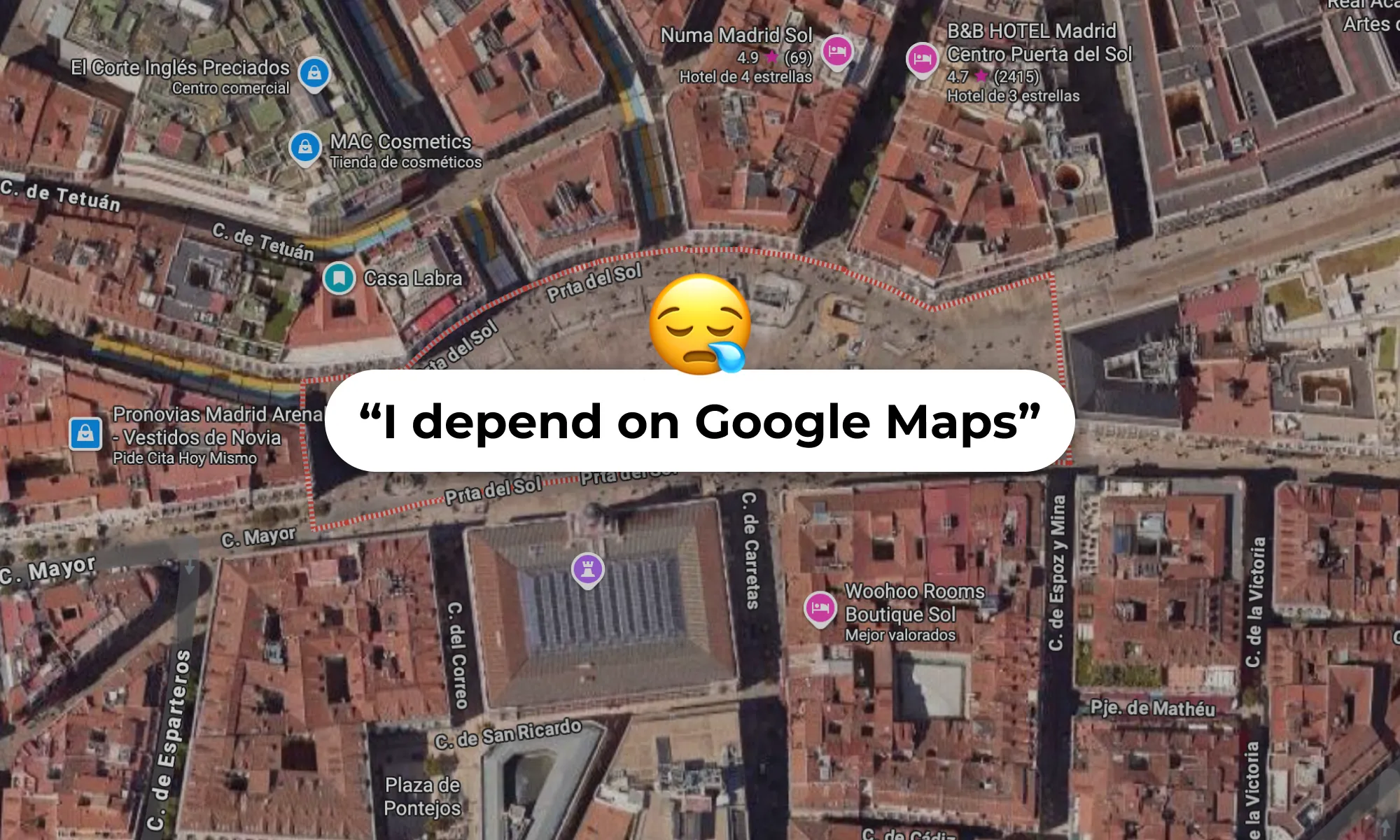
Users were forced to leave Stayforlong to search for essential contextual information (public transportation, POIs, parking, Street View to check for the nearby streets, etc.) generally on Google Maps, disrupting the booking flow and adding unnecessary effort. This reduced the efficiency of the map and confidence in our platform.
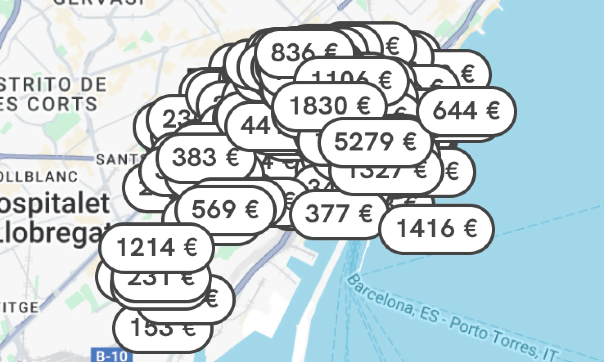
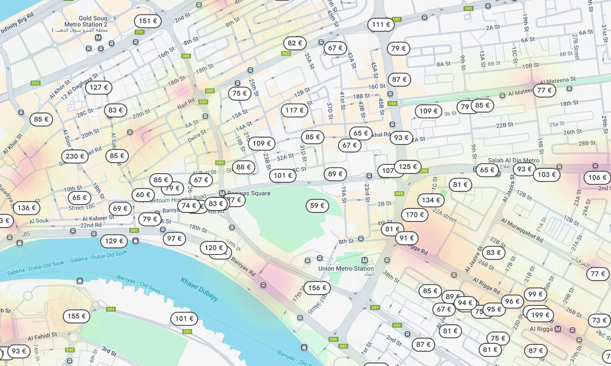
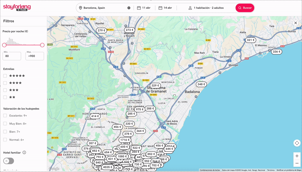
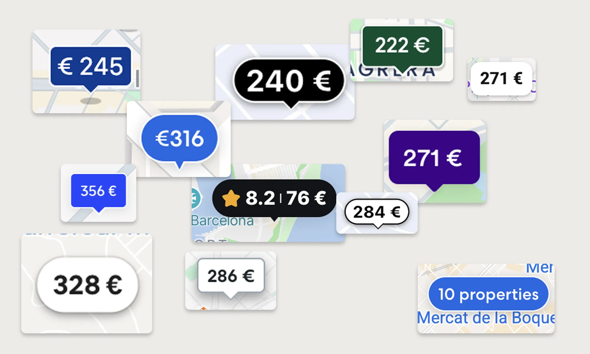
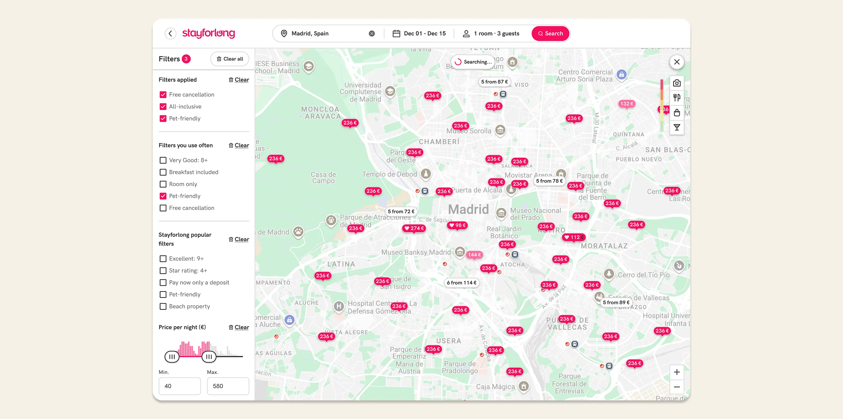
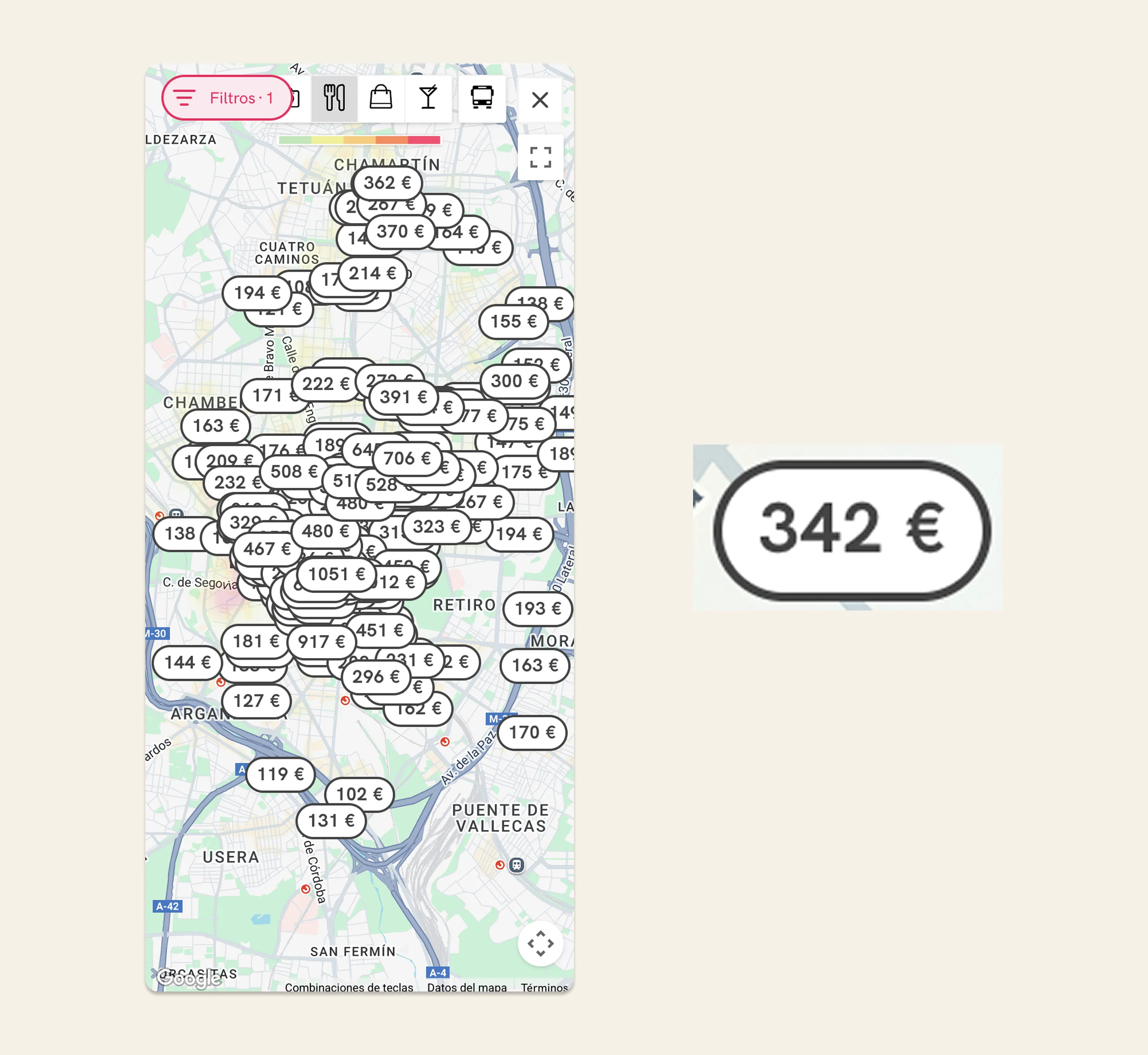
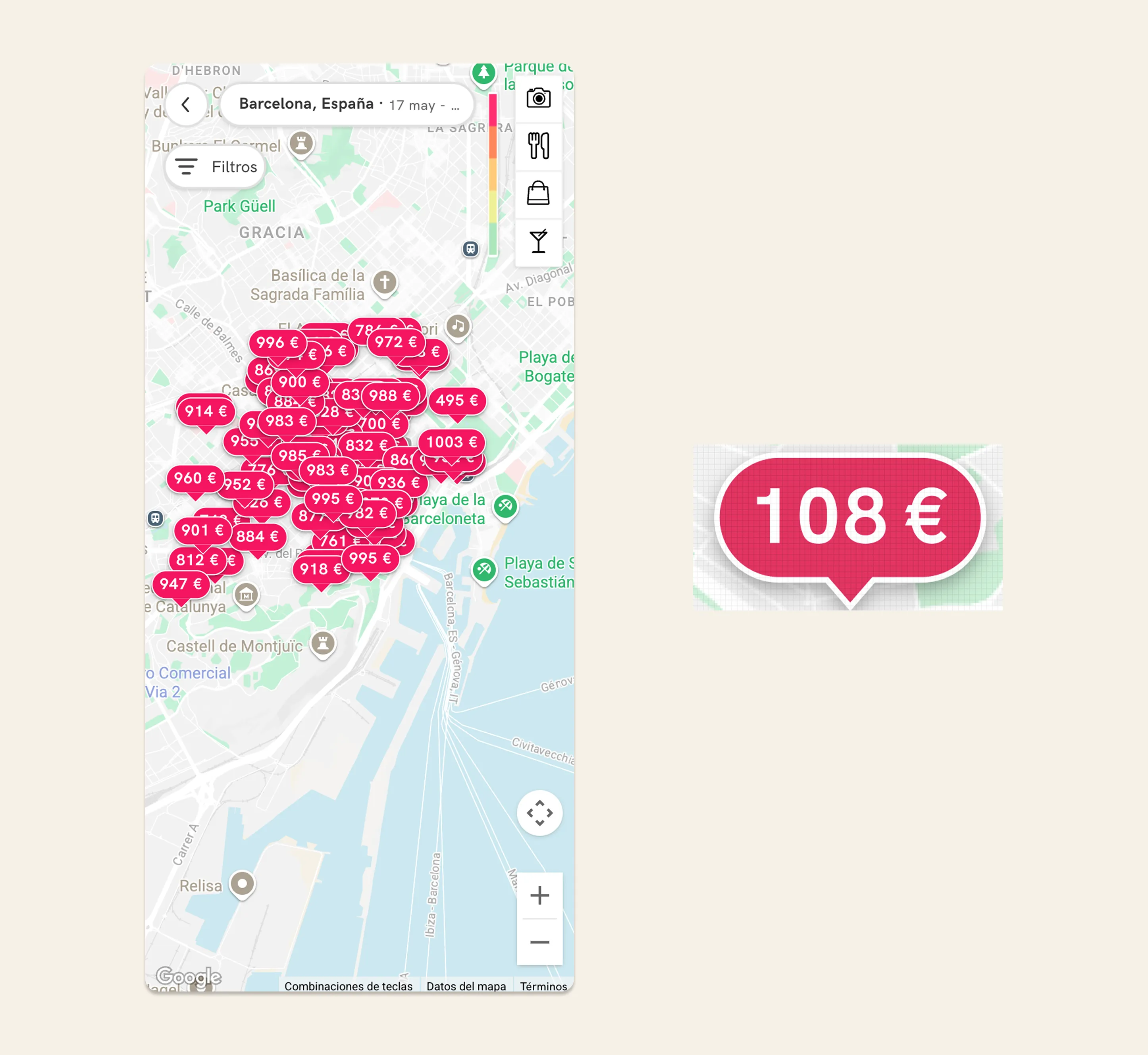
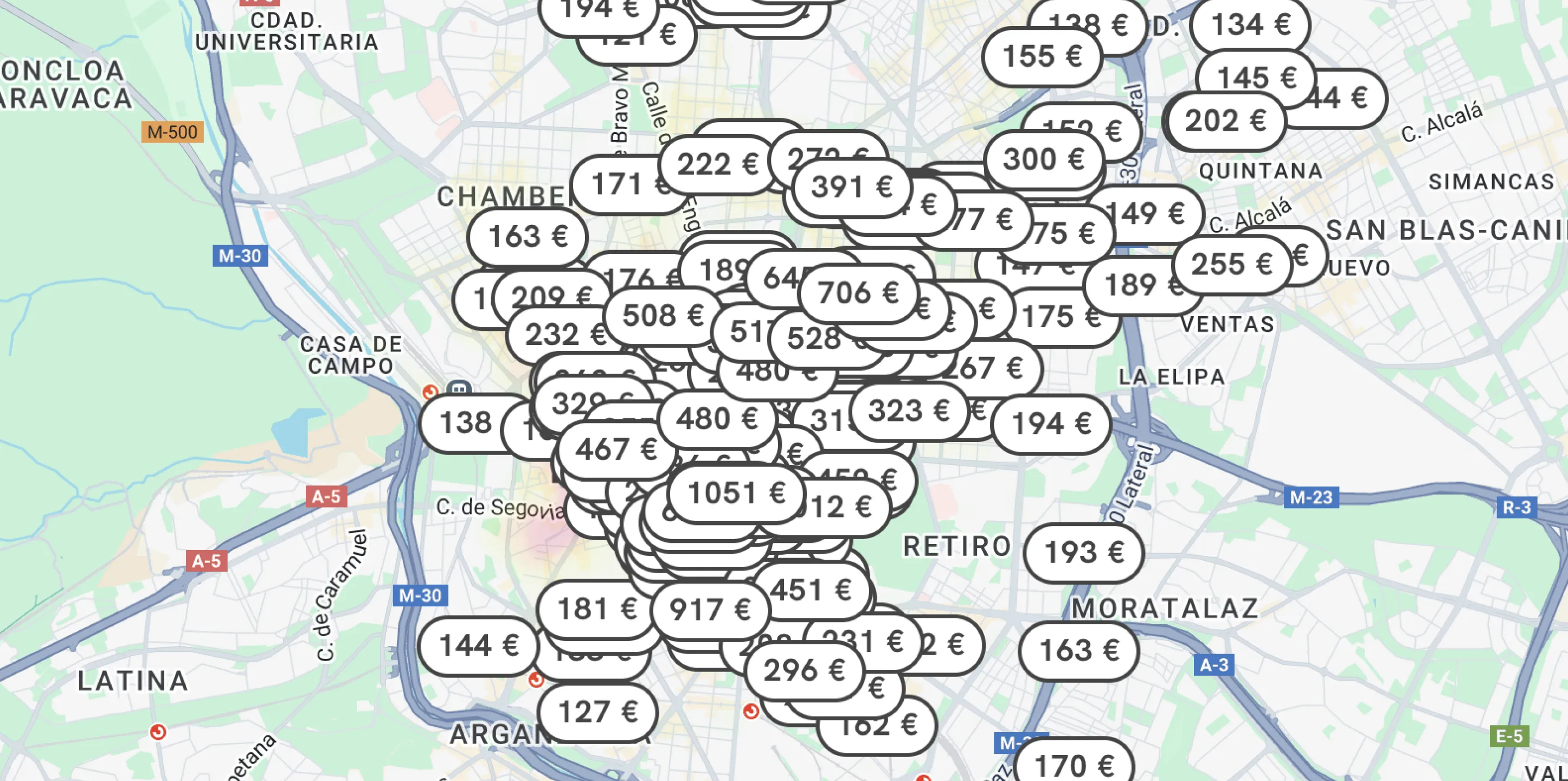
Low visual clarity and clutter
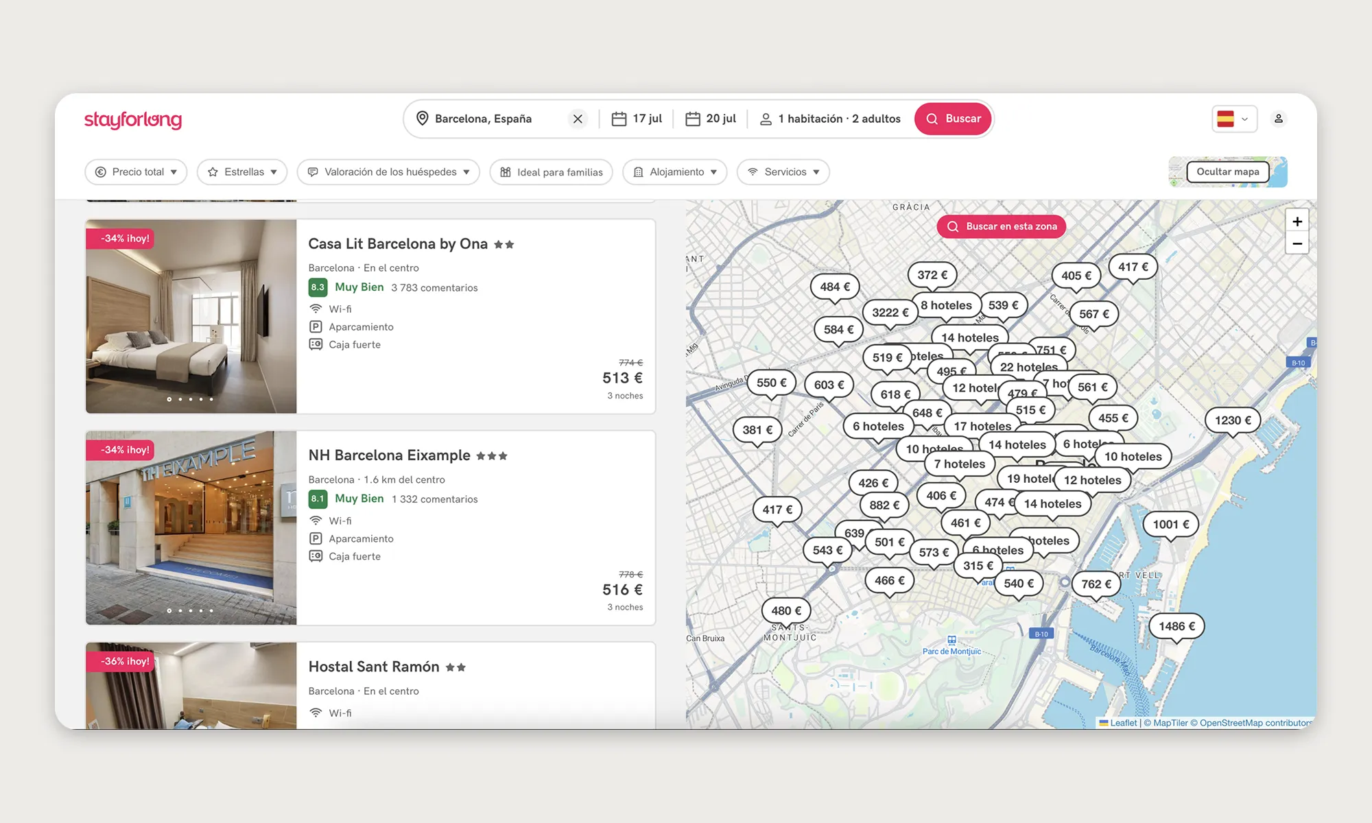
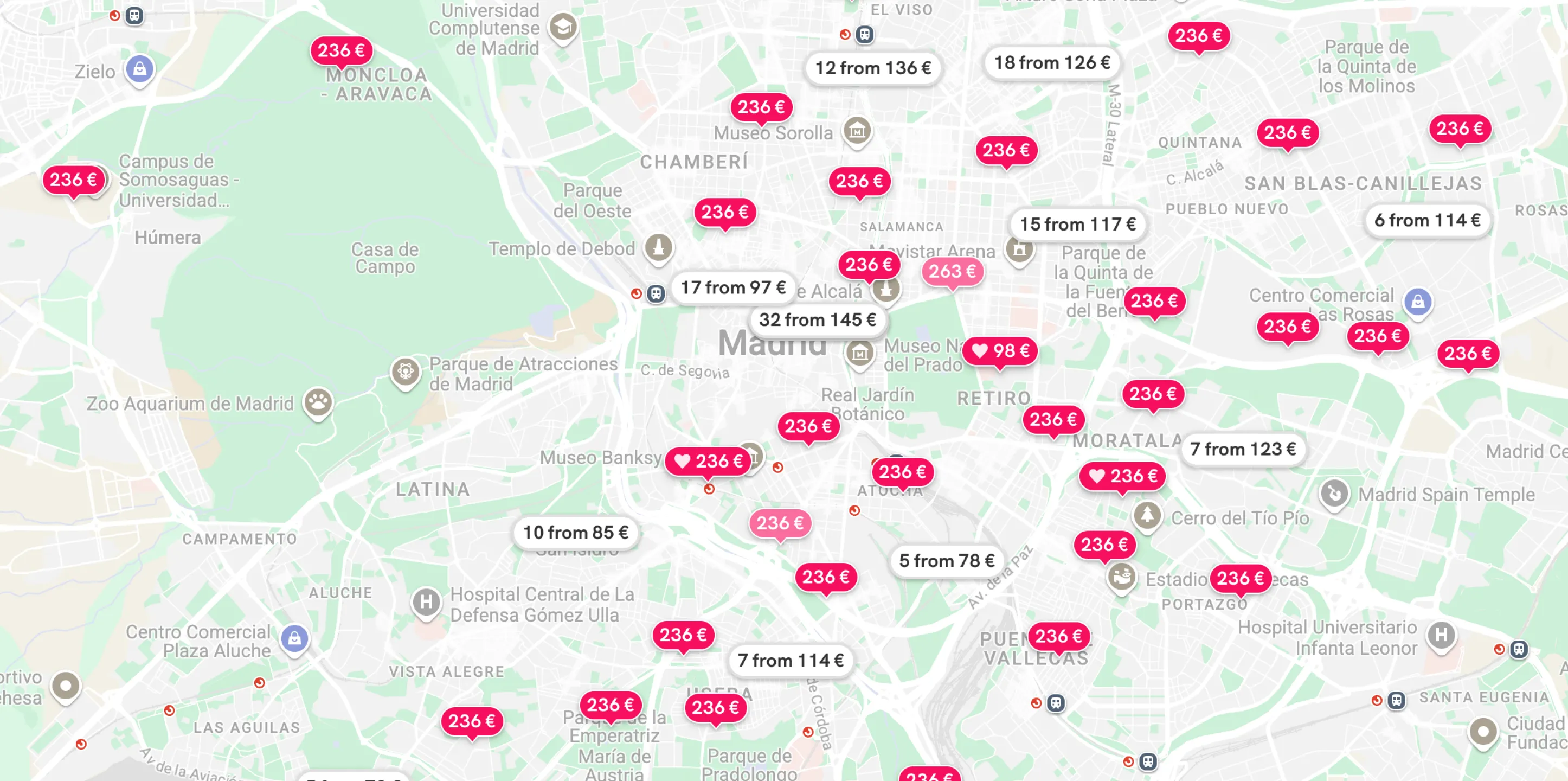
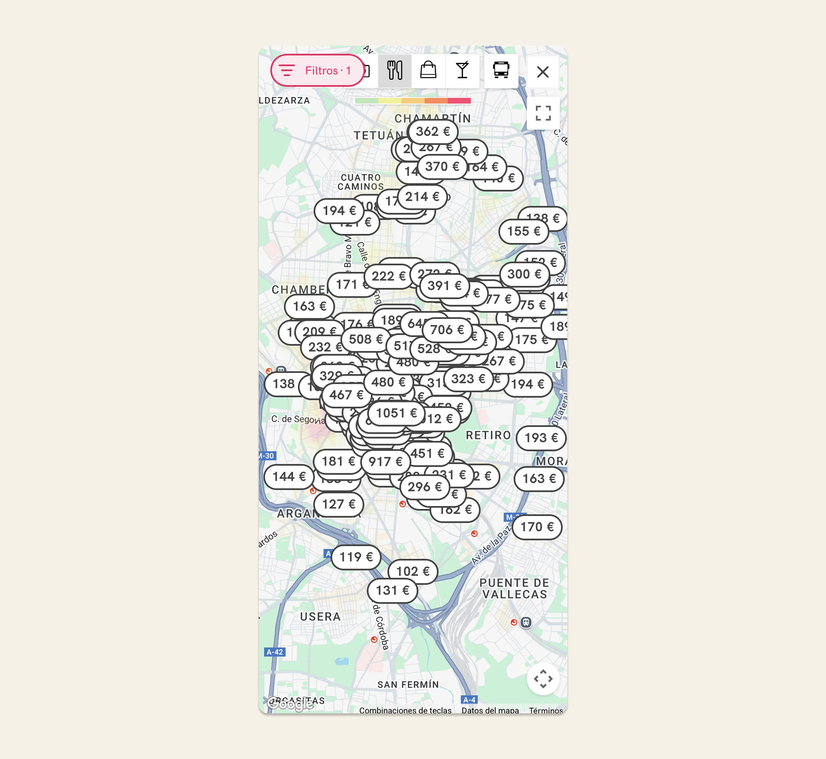
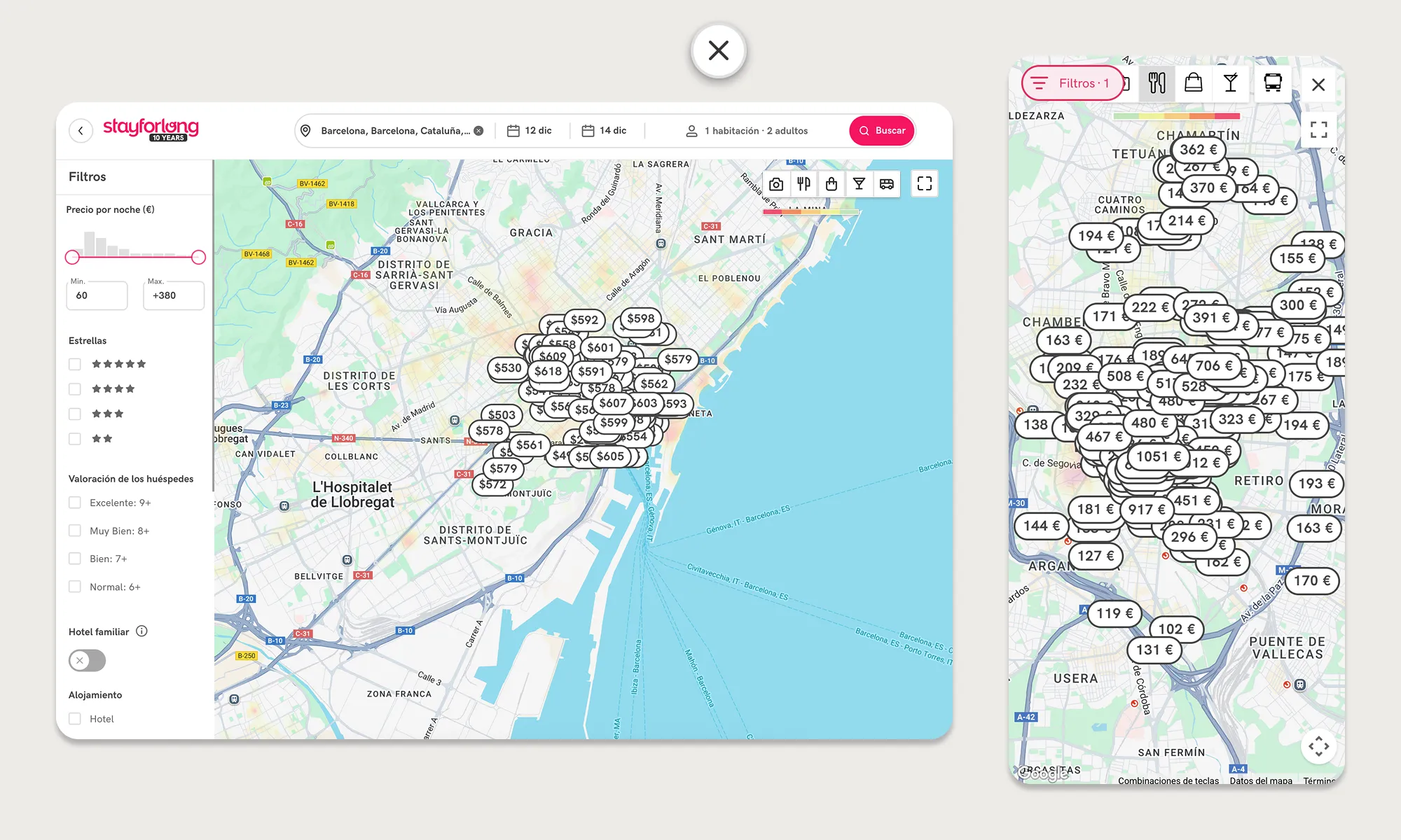
The map was visually cluttered with overlapping price markers, especially in areas with a high density of hotels, forcing users to zoom in excessively to distinguish between options.
Redundant and confusing features
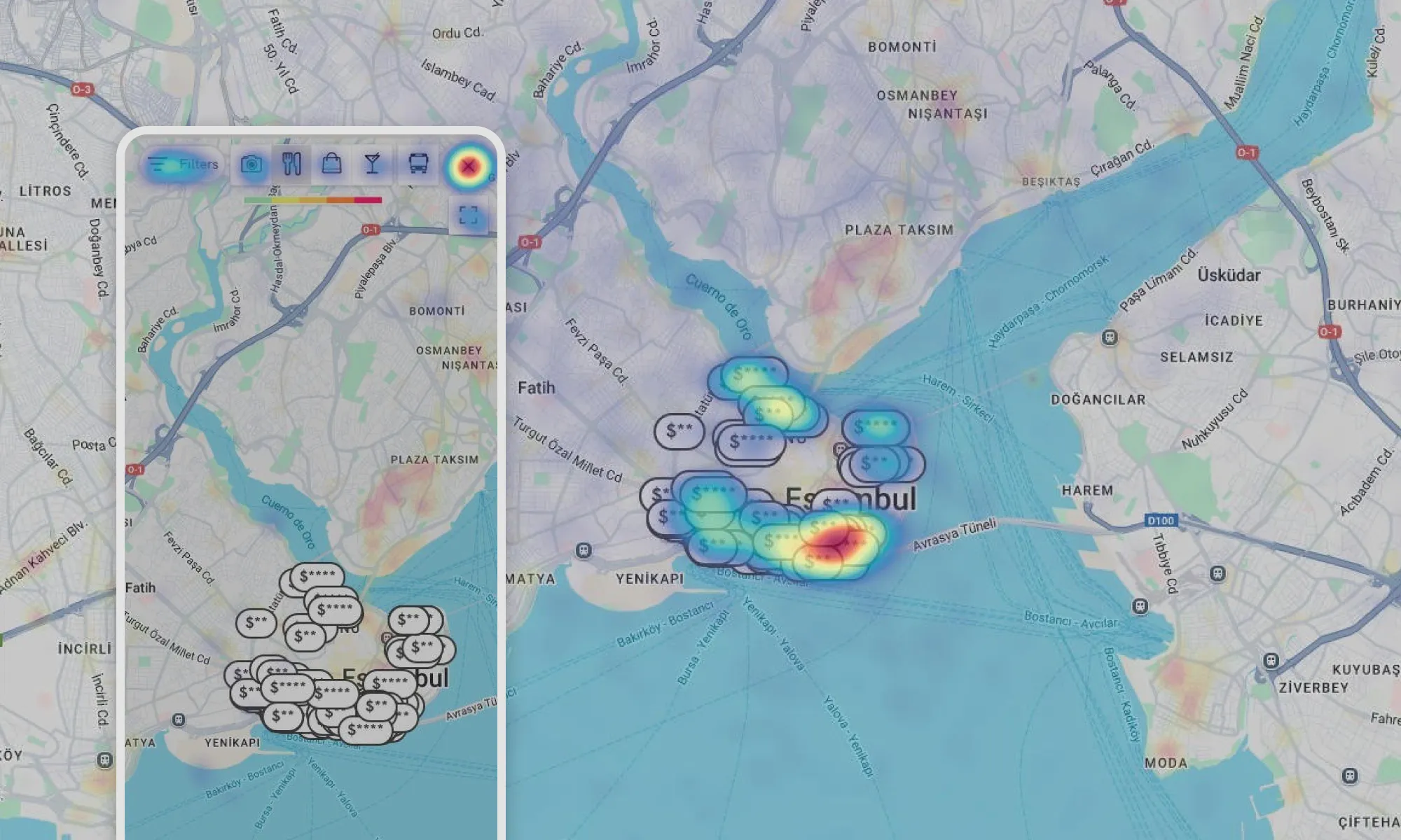
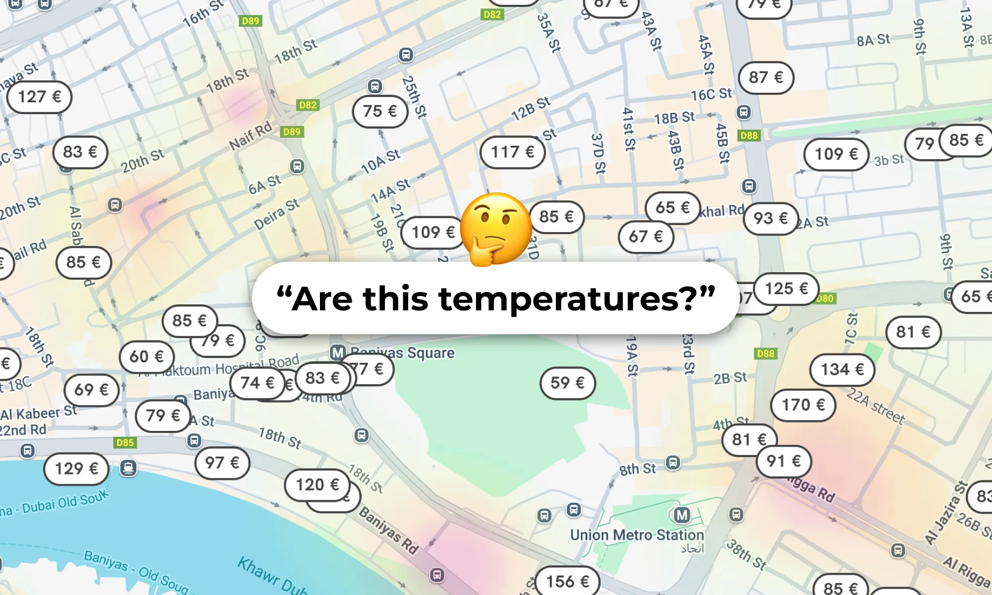
We offer a feature provided by the external company AVUXI that allows us to highlight areas with the highest concentration of restaurants, shops, points of interest, nightlife, and public transportation stops using a color map. Lack of visual clarity affects aesthetics and minimalist design, but more importantly, the user's ability to interpret the information presented on the map. User quote: “This might be the expected temperature in the streets of the city?” 🤔
Performance and usability issues
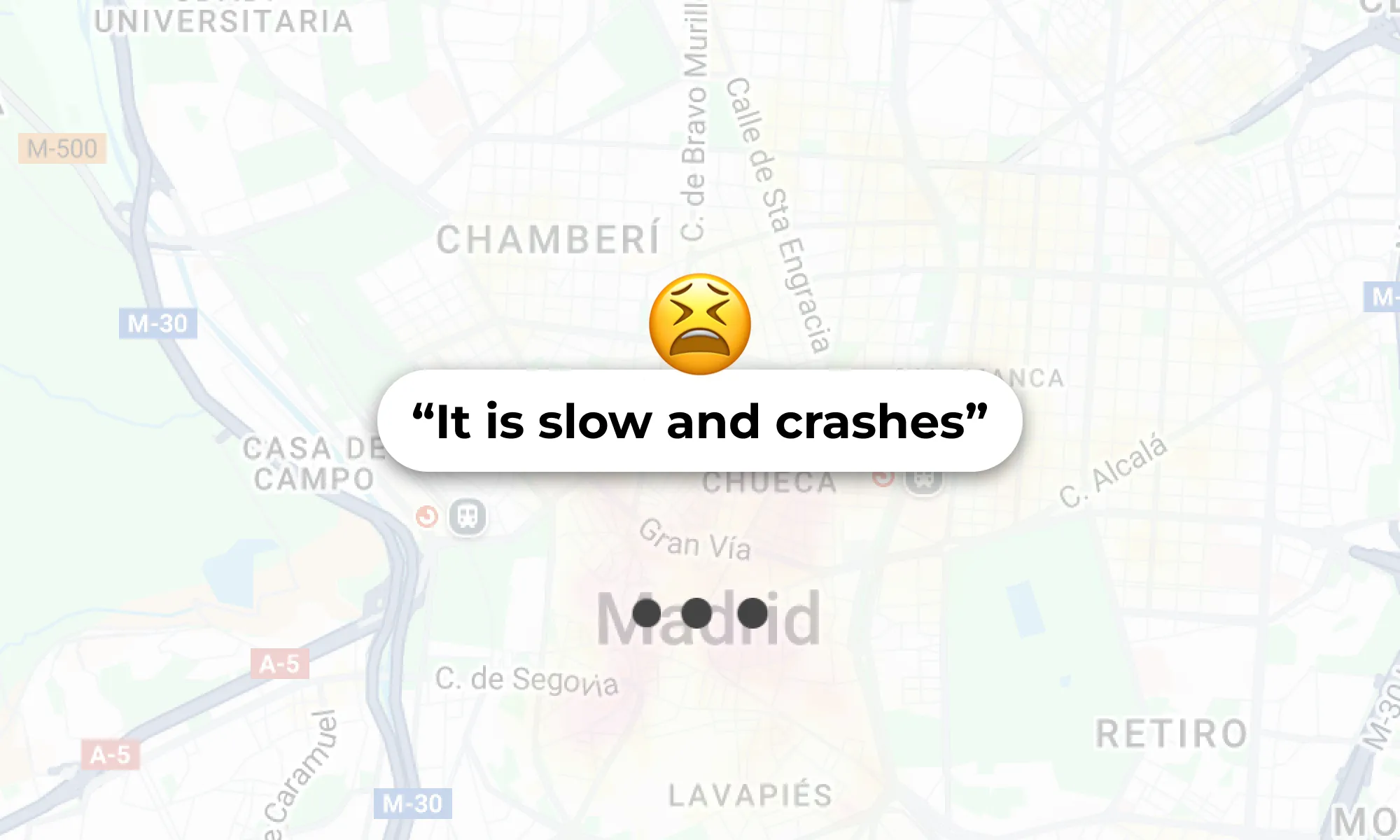
The map suffered from slow load times and frequent crashes when zooming or scrolling, hiding previous results and conveying a feeling of slowness, lag and poor fluidity. This resulted in rage clicks and a frustrating experience, especially on mobile devices where sessions were significantly shorter.
Deficencies in hotel exploration
Once we discovered that images were the most consumed element of hotel information in the map, we found that the images carousel were too small on hotel cards and generated rage clicks. The position of the hotel cards also generated fricions in specific viewports. On the other hand, as we conducted our research, we discovered a lack of assistance features to facilitate map exploration, such as highlighting visited and favorite hotels on the map in a clear way, including a search bar to navigate to different locations, searching based on points of interest, etc.
Previous unsuccessful experience
There was some mistrust within the company about optimizing the map, as in the past (before my arrival) an unsuccessful attempt had been made to redesign integrally the map. The initiative was not approached in an agile manner and at the end of the development doubts and risks emerged from some stakeholders preventing the new map from being tested for validation. The risk with the new design was that it concentrated too many changes, making it very difficult to attribute good or bad performance in an AB Test to a specific feature. I compiled all the lessons learned, including both good and bad practices, during that project.
GOALS
Project Objectives
Our mission was to enhance the user experience (UX) in Stayforlong's search engine and map features by implementing continuous changes and delivering value in an incremental and controlled manner.
The objectives defined for this project seeked to improve both the user experience and key business metrics:
- Understand how users interact with the map feature on Stayforlong’s website.
- Identify pain points, usability issues, and areas of improvement for the map.
- Determine how users leverage the map in their decision-making process when booking hotels.
- Compare user expectations with competitor mapping features (e.g., Booking.com, Expedia, Google Maps).
- Identify missing information users need on the map to make informed booking decisions.
- Improve the clarity and usefulness of the map interface to increase engagement and conversion rates.
“We are committed to establishing a solid, high-quality foundation that will enable us to match the industry's major competitors, generating pride throughout the company for the excellence of our map UX.”
Success KPIs
Considering the main KPIs we wanted to impact with the map improvement, we considered different scenarios.
-
Increase conversion rate from map to booking (M2B): Of all unique sessions that had at least 1 map page view event, how many then ended up in a booking. Reference value: 29%
| % point increase | M2B Goal | % increase | |
|---|---|---|---|
| Conservative | 0.5 - 1 | 29.5% - 30% | 1.5% - 3% |
| Realistic | 1 - 2 | 30% - 31% | 3% - 7% |
| Ambitious | >2 | >31% | >7% |
-
Increase click-through rate of the map (CTR): Of all unique sessions that had at least 1 map page view event, how many then had at least 1 click on a hotel of the map. Reference value: 35%
| % point increase | CTR Goal | % increase | |
|---|---|---|---|
| Conservative | 0.5 - 1 | 35.5% - 36% | 1.5% - 3% |
| Realistic | 1 - 1.5 | 36% - 37.5% | 3% - 7% |
| Ambitious | >1.5 | >37.5% | >7% |
-
Increase map visits (MV): Of all unique sessions, how many had at least 1 map page view event. Reference value: 4300/day
| Daily Visits | % increase | |
|---|---|---|
| Conservative | 4300 | 0% |
| Realistic | 4550 | 5% |
| Ambitious | 6750 | >10% |
The goal for this project is to increase CTR and M2B while being able to maintain the current daily map visits level. We do expect to achieve a possible organic growth of the daily sessions, but until we achieve stable outcomes that improve the first two metrics, we do not see the need to increase traffic on the map. Then we can explore other iterations in future projects that allow flexible exploration of the map alongside the list of outcomes in a 50/50 layout, for example, to increase traffic to the map.
We firmly decided with the team that this would be the ideal development path, so that we can recover from the errors done in the past were it was planned a 50/50 layout (map and hotel list results) without reducing before the frictions in the map.
Data Requiremets
At Stayforlong, universal and independent control and access to metrics is a priority. In a weekly sync meeting between the Product Trio (Engineering Manager, Product Manager, and Product Designer) together with the Data Manager and Web Analysts, we defined the metrics and configured the necessary dashboards (in Looker Studio) to monitor the project's success metrics and the parameters needed to filter data (device, traffic source, date range, etc.). This allowed everyone involved in the project's cross-functional team to monitor the KPIs.
“The observability of end-to-end metrics is a major concern for the team of Data Engineers at Stayforlong. That is why we have specialized dashboards for each page of the user flow to keep track of them.”
Together with the Data team, we defined the success KPIs and established additional requirements to ensure proper monitoring of the project.
-
Sequence-to-sequence control: We created a dashboard with several graphs to monitor all the steps in the user flow that interacted with the map, from the map to the hotel details page, from the map to the results list, from the map to checkout, and from the map to completing a reservation.
-
Filtering sessions that distort data: At Stayforlong, we often receive bot attacks, which distort metrics and could make it appear that we are deviating from our objectives. Having a monitoring system that allows us to exclude these sessions from the measurement was key to understanding the success of the project, using an effective traffic source filter.
-
Generalized CTR control: We ensure that all elements that are important in the new flow have a click event that we can measure. This includes map navigation elements (the search bar, zoom and movement controls, and the button to close the map), map interaction elements (hotel markers), and elements within the hotel information cards.
Being able to observe the progression over time of these metrics would help us understand if we were being able to generate a positive impact on business metrics with the implementation of the changes and improvements made in this project. On the other hand, measuring the success of the different implementations and progressive improvements on the map by a release note system, would allow us to be more agile and not having to develop AB Test to validate each iteration, as well as being able to understand in much better detail its performance.
DISCOVERY
Research Plan
With a clear definition of the project objectives and the alignment of all stakeholders involved in the project's cross-functional team, I begin to develop the research plan by defining the initial research questions, from which a series of research methodologies will be developed. I started to develop the plan at the end of February 25’. The idea we agreed on in the Product Trio was to have delivery for this project in May so we could tackle the development during Q3 2025.
Research questions
- How often do users engage with the map feature when searching for hotels?
- What are the most common actions users attempt on the map (e.g., zooming in, filtering, clicking on hotels)?
- Do users find the map easy to navigate and interact with?
- What information do users expect to find on the map (e.g., hotel prices, landmarks, distance to attractions)?
- How do users compare hotel locations using the map?
- What role does proximity to key points of interest play in their booking decision?
- How do users evaluate the location of a hotel when making a booking decision?
- What challenges do users encounter when using the map?
- Are users able to find the information they need quickly?
- Do users feel that the map provides accurate and sufficient information for decision-making?
- How does the Stayforlong map compare to competitors' mapping solutions?
- What additional functionalities would users like to see on the map?
- Do users want more filters, such as price range, ratings, or public transport access?
- Would integrating local attractions, public transportation routes, or real-time availability improve their experience?
- How does integrating Google Maps or OpenStreetMap data compare to the current experience?
I always start every research project by narrowing down the scope of the investigation, defining clear research goals and research questions. This helps me focus on solving only the initial questions I plan, helping me pick better the methodologies needed to achieve the specific results for the research, and not end up with research conclusions that drift from the initial research objective. Also, in my experience, I have found that this is the best way to work to ensure I am aligned with the team.
Methodologies
So, based on the objectives and research questions, I defined the next steps to be able to gather the required data at every stage of the research plan with the ideal UX Research methodology to be able to find answers to the research questions.
-
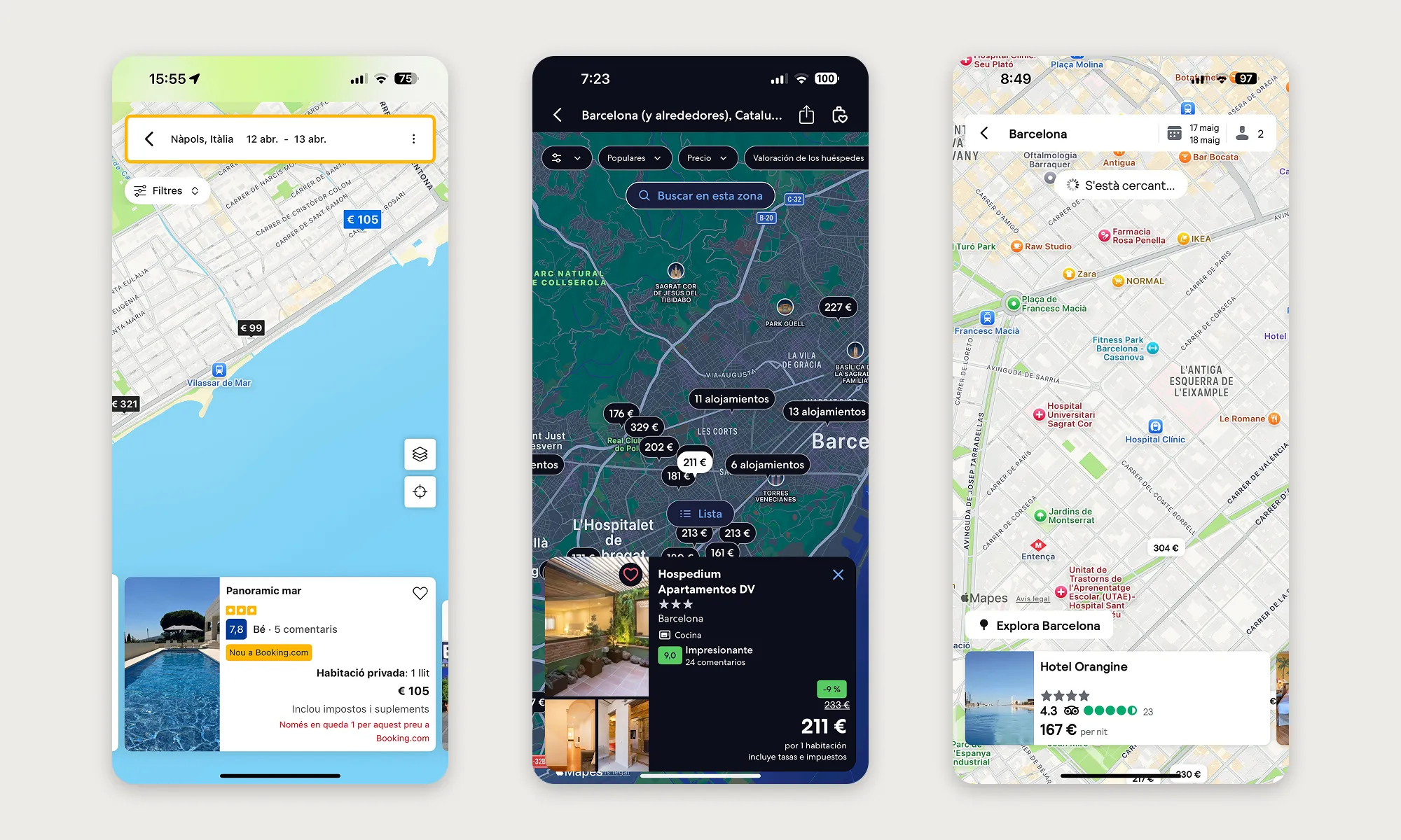
Competitor analysis: I started the research performing a heuristic evaluation in several competitor websites in order to review in depth their Map pages and all the different features they offer. This would help me identify best practices, compare different solution approaches to possible UX frictions we identify later during different phases of the research and, finally, detect in which features or areas of the experience our map was lagging behind industry standards, also to better understand user expectations. You can see the competitor research in detail below in the case study.
-
User interviews: Exploring the mental models and expectations with 5 users in a live task-based interview focused exclusively on the map was extremely valuable to help me identify the most critical UX frictions and also new potential oportunities. See what we’ve learned from the user interviews I performed here.
-
User surveys: I wanted to gather large volume data asking our users about their satisfaction with the current map experience as well as being able to gauge feature expectations. I made sure to collect feedback from +200 respondents to ensure statistical relevance. See here the key results from user surveys.
-
Behavior analysis: Analyzing real user interactions with the current map would be key to understanding the main friction points and unmet needs that the current UI wasn’t offering. Read here the key findings from this analysis.
-
A/B Testing Design: Due to the complexity of prototyping the map's behavior, I propose that the team validate certain higher-risk improvements using AB Tests, as this is the best way to validate the real impact using the actual production search results database (+720k hotels). Here are the tests developed.
DISCOVERY
Competitor Analysis
As a fundamental part of the discovery and research phase, a comprehensive competitor analysis was conducted to understand how leading Online Travel Agencies (OTAs) design and implement their map experience. The main objective was to identify industry best practices and, crucially, opportunities for Stayforlong to differentiate itself, in order to guide the optimization of our own map and increase user interaction and conversion rates, and providing information for the future stages of research.
-
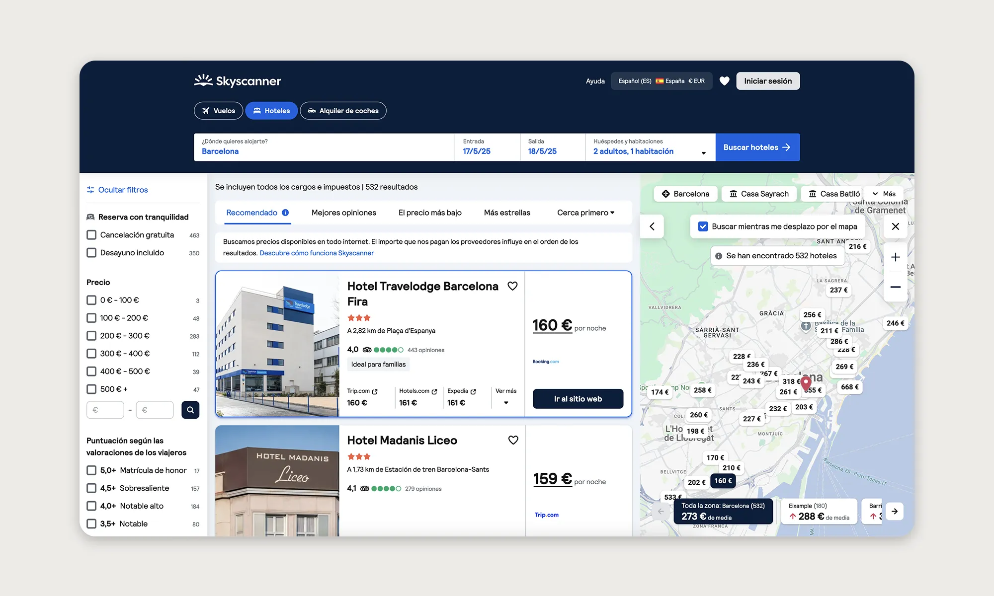
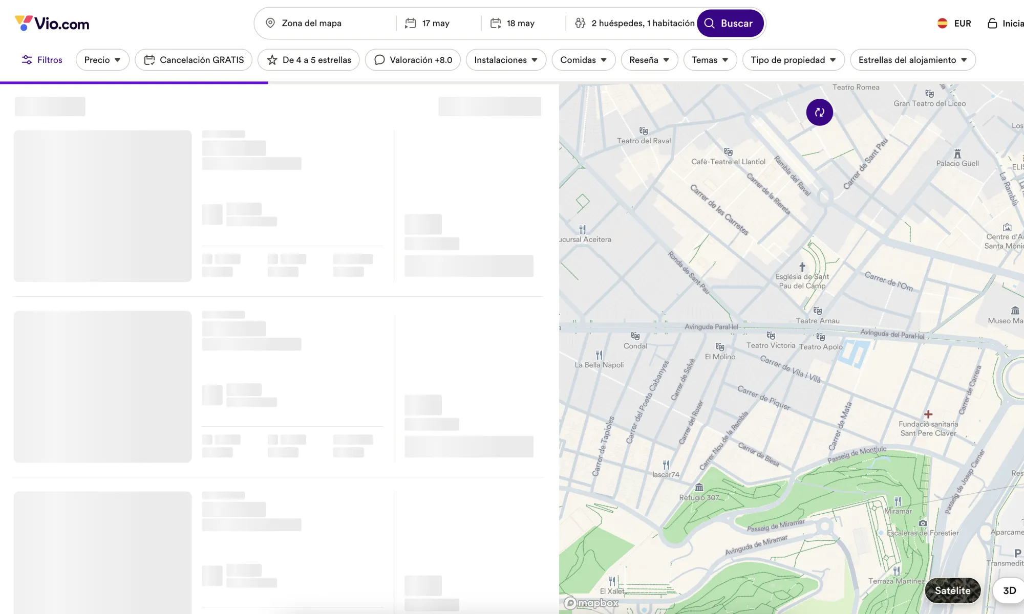
Methodology and reach: A detailed heuristic evaluation and a comparative benchmark was conducted with 14 competitors (Booking.com, Expedia, Hotels.com, Skyscanner, Airbnb, Trivago, Kayak, Google Maps Hotel Search, Vio.com, Zenhotels, Hostelworld, Trip.com and Tripadvisor).
The analysis focused on nine key areas of the map experience:
Entry point to map
How easy is it to find and access the map? Is it a button? A tab? It is inviting enough for users to use it?
Loading speed
How fast does the map load? Is it smooth when zooming/moving? Speed is critical for user retention.
Hotel marker design
How are hotels visually represented (pins, cards, prices on pins)? Is it clean or cluttered?

Filters and sorting
What filters are available directly on the map (price, rating, distance, amenities)? Powerful filters can drive decision-making.
Info on hover/click
What info pops up when a user clicks or hovers on a hotel (price, photos, reviews)? Info should be immediate and relevant.
Map & results sync
Is there a live connection between list and map (highlighting)? Help user cross-compare easily.
POIs and Landmarks visibility
Can users see tourist attractions, transport stations nearby? Adds critical context for booking.
Distances and Transport
Do this competitors show walking/driving distances to landmarks? Reduces user uncertainty.
Key findings & recommendations for Stayforlong:
- The map experience is treated as a critical part of the hotel booking journey across major competitors.
- Users expect fast, responsive, context-rich maps where they can easily find, compare and select accommodations without any friction.
- Access to map has to be prominent on top of the search results page or even offer flexible visualizations combining the map and the results list by default.
- Users expect a fast initial load (<2s), never blocking its interaction.
- Price should be displayed directly in the map marker, most competitors group nearby hotels in clusters to help declutter the map.
- The filters are an essential tool to help users search for their hotel in combination with the map.
- Users have to be able to compare key information of hotels directly on the map, without having to navigate to the hotel details page. Some competitors achieve this by displaying hotel cards over the map on hover on the map pins or by clicking them.
- The map has to offer information about transportation and tourist attractions, and distance to popular POIs are nice-to-have features.
“Modern travelers don't just book a hotel, they book a location and an experience.”
Competitor benchmark conclusions.
Unique or standout features
Draw search area
A feature that is much more common in the real estate and apartment rental sector, Kayak and Google Travel allow users to draw their own search areas.
3D or satellite layers
Display formats other than the original political map provides contextual information that can be extremely valuable, especially for certain types of users.
Distance measurement
Some competitors includes a manual ruler to help users measure distances in KM on the map.
Context info
Google Travel offers rich information on “where to stay”, “when to go” (weather, crowds and prices), and average prices per category, provided by the Google ecosystem.
Competitor analysis conclusions
Stayforlong had a clear opportunity to massively boost engagement, trust, and conversions by offering a faster, more informative, and highly interactive map experience, aligned with the best in the industry. Prioritizing the optimization of the map UX was essential to differentiate Stayforlong in a crowded market and meet the growing expectations of current users.
This analysis served as the direct basis for the priority recommendations (short, medium, and long term) that were detailed in the sesign and prototyping phase, addressing everything gathered during this research phase.
DISCOVERY
User Interviews
The purpose of the user interviews was to gain deeper understanding of how users interact with the map feature at Stayforlong website, identify their pain points, unmet needs and expectations. I conducted task-based interviews where users needed to complete specific map-related tasks, this way I was able to explore the users’ mental models and obtain contextual insights regarding the map features.
Methodology and reach
I conducted a total of 10 interviews with users of varying demographics and markets. I carried out the entire interview process, from recruitment and scheduling interviews, preparing scripts and tasks, conducting interviews, and its analysis. The requirements for recruiting users were that they had made a reservation in the last 48 hours, were between 40 and 55 years old (the age of our key user persona), and were from a variety of countries of origin in order to obtain insights from a more diverse source. The final distribution of users interviewed was as follows: 2x ES🇪🇸, 2x US🇺🇸, 2x TK🇹🇷, 1x MX🇲🇽, 1x GB🇬🇧, 1x FI🇫🇮, 1x PL🇵🇱.
What I asked and why?
The interviews were structured into four key parts:
-
Context and use of the map: to understand users' previous experience with the map without any bias.
-
Live review of the different elements of the map: to explore the perception of clarity of the different elements that constitute it in a review through specific tasks.
-
Filters and features: to investigate the map search experience, focusing on the comparison with their previous experiences with other competitors.
-
General opinion and suggestions: to request general out-of-the-box feedback, aspects of the Stayforlong map that are most and least liked, and what would be changed or improved.
What did we learn?
The interviews revealed several “eureka moments” that were key in redefining the problem and guiding solutions. These findings, together with those from competitor analysis, formed the basis for the next steps of the research.
Fragmentation of experience
A recurring finding was the constant need for users to rely on Google Maps or other external tools to obtain crucial contextual information. Users searched for data such as parking locations, hotel surroundings (Street View), subway/bus stations, and points of interest that they could not find directly on the Stayforlong map. This showed that the map wasn’t working as a centralized decision tool.
Lack of clarity with the POIs feature
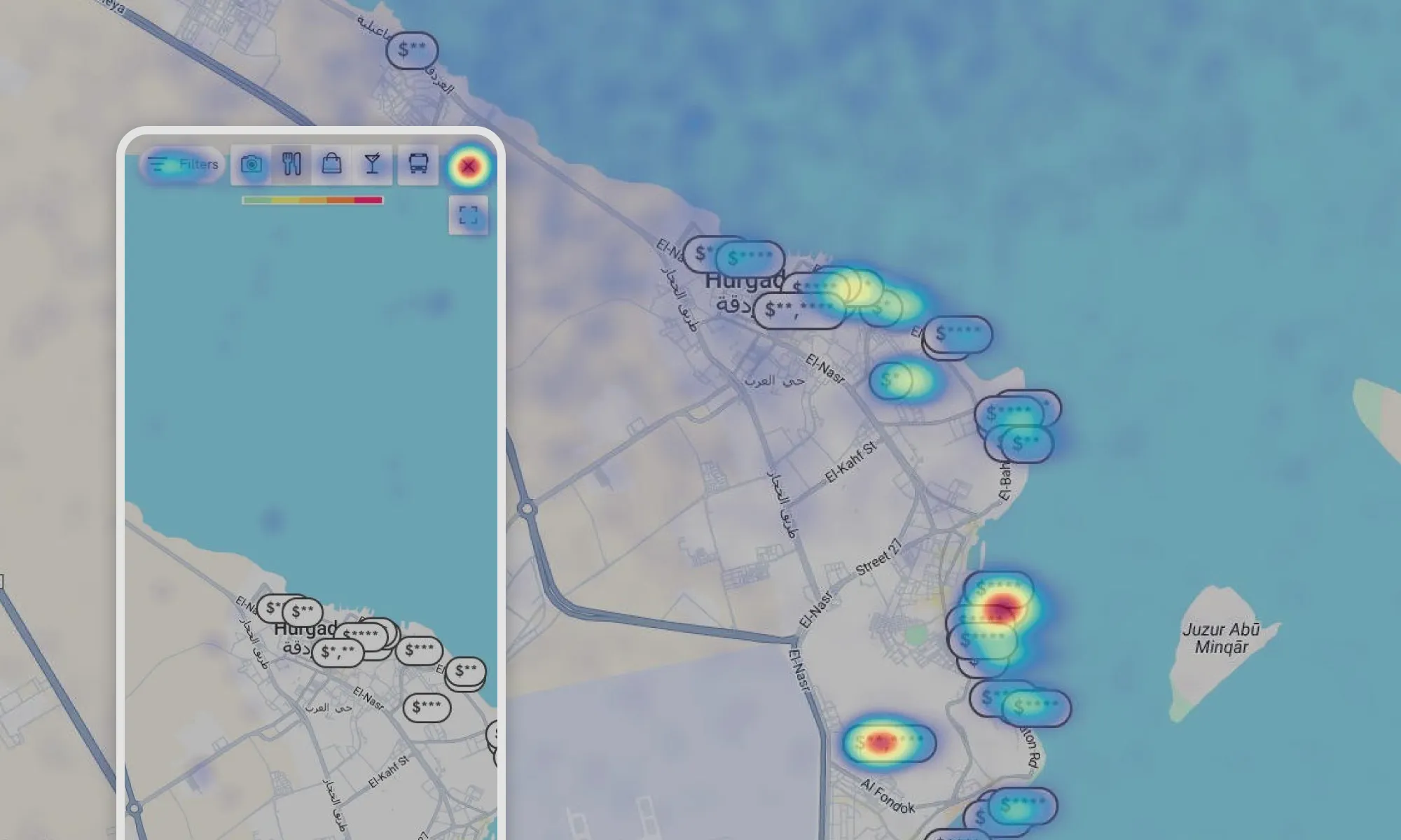
We used to include a feature in our map from an external company called AVUXI that highlights the bars and points of interest with a heatmap overlay. User feedback showed lack of clarity with the way in which we displayed the feature, that needed to be rethought.
Performance and usability problems
There were clear complaints about slow loading and frequent crashes when zooming or scrolling, also we received complaints about desktop scroll sensibity.
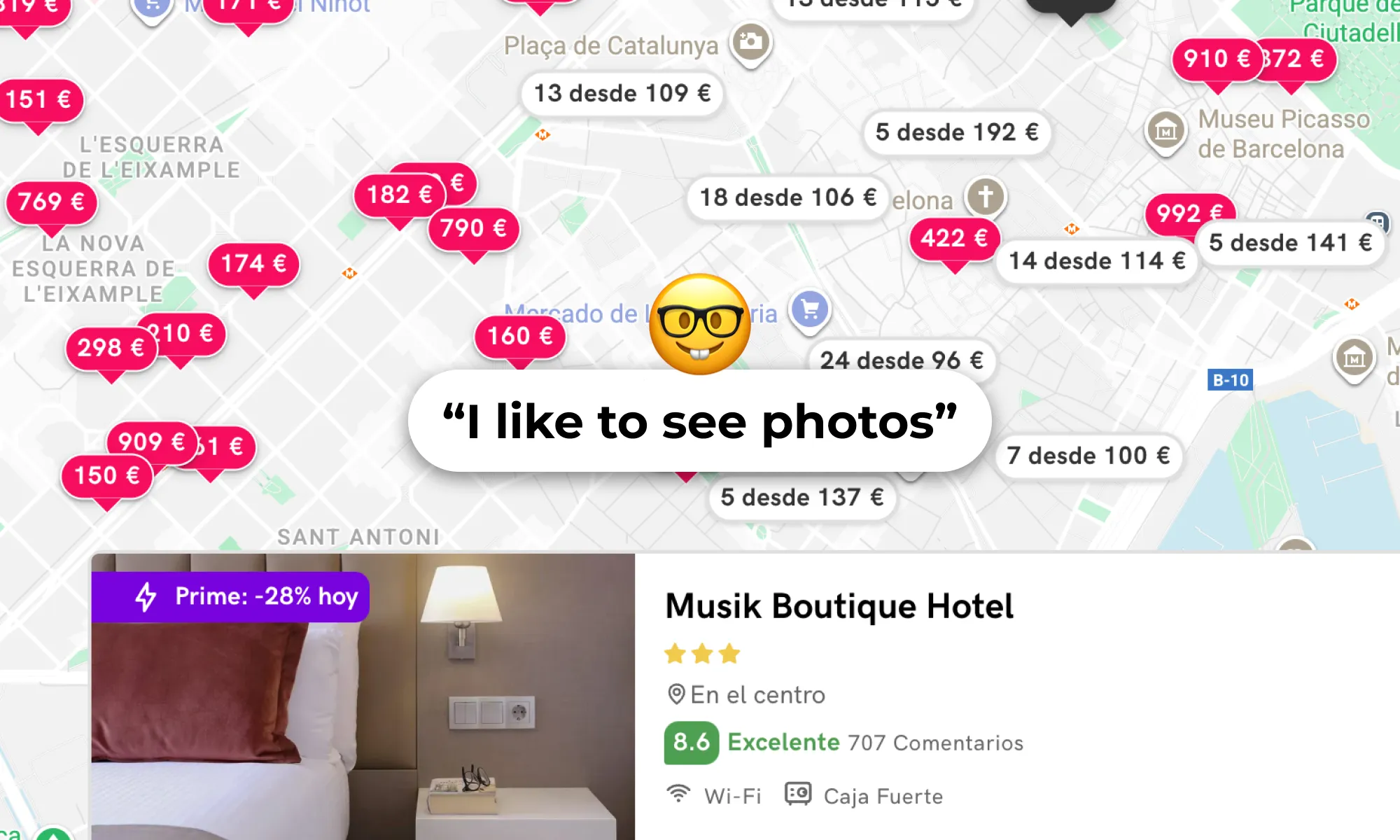
Importance of the hotel images
The most important element users wanted to see to be able to compare between their different options was the hotel images. We were able to detect certain problems on how the images were displayed and that in some devices looked too small to be able to swipe between the different images easily.
Lack of contextual info
The old map was lacking lots of important POIs that were crucial to help users make an informed booking decision. Users liked that we were showing some public transport stations but felt that in some cases we were still lacking some important ones.
Generalized feedback
Reviewing the map UX with live-task interviews was also very profitable because it allowed us to understand lots of user expectations regarding the map micro-interactions and helped inform future design decisions.
“I need to search the area around the hotel on Google Maps to see if there are any parking spaces nearby for people with reduced mobility, because I have a 34% disability.”
The importance of designing for all.
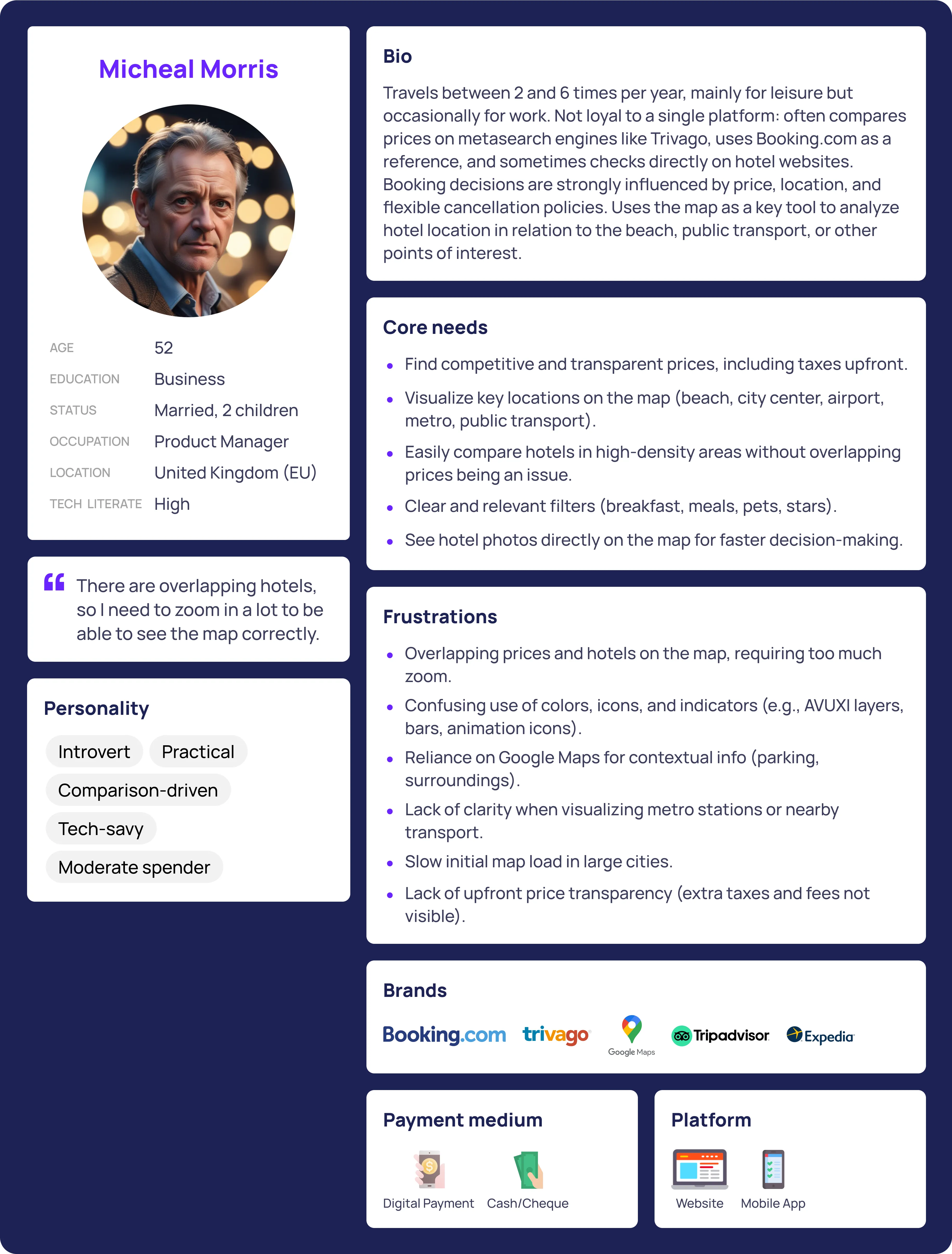
User Persona
Once the interviews had been analyzed and the main feedback compiled, I also created the User Persona asset to use as a reference for the rest of the project, using the data obtained during the interviews.
DISCOVERY
Behavior Analysis
To complement the qualitative insights gathered during the interviews, I conducted a behavioral analysis to validate the findings on a large scale. I focused during this phase of research in uncovering patterns of usage and repeated friction points.
Methodology and tools:
I used Google Analytics and Hotjar to gather and visualize user interaction data. We tracked clicks, scrolls (movements) and zooms in the map, identified abandon points, analized user sesion duration and visualized heatmaps for user clicks in our top locations and several session recordings. This research was key to diagnosing problems and gathering actionable insights on a large scale.
Key Findings and repetition patterns
This are the main findings that we came across with the Behaviour Analysis:
-
No correlation between interactions and conversion: a higher volume of map visits or high number of clicks on hotels do not automatically guarantee a higher proportion of bookings, days with higher volume often show lower M2B efficiency.
-
User behavior on mobile devices vs. desktop: clicks on mobile devices were more scattered, covering larger areas and showing a lower concentration of clicks on hotel markers. This is considered normal due to touch interactions and smaller screen sizes, which require users to zoom in and scroll more. This reflected low usage of physical controls on the mobile map.
-
Sessions on the mobile map were significantly shorter: less than 50% compared to the desktop, which could indicate a poorer user experience on this device.
-
No correlation between elements with higher interaction among devices: on desktop, the search bar on the map has a lot of interaction, but we don't show it on mobile, allowing us to identify an opportunity.
-
Repeated patterns of rage and dead clicks: most occurred inside the map container, especially with the action of zooming, the calendar on the search bar and the carousel button for the images of the hotels. Adding a zoom control would assist users with this behaviour without having to click multiple times the map to zoom in.
-
Performance and blocking issues: users wanted to navigate the map even while it was loading new results, but the map would freeze.
-
Usage pattern focused on hotel images: we detected that images are the central element in the hotel's decision-making process, and we detected friction on mobile devices.

-
Visual ineficencies: due to the positioning of the hotel information cards, certain information is displayed wrongly.
DISCOVERY
User Surveys
As part of the map optimization project, user surveys were a crucial methodology within the discovery and research phase, aimed at collecting quantitative and qualitative feedback on the existing map experience. This method was specifically chosen to gauge overall user satisfaction and identify specific feature expectations from a statistically relevant number of respondents.
Methodology and execution
The survey was active for three days, from May 6th, 8:00 AM, to May 9th, 5:00 PM. It was distributed across multiple languages including English (EN), Portuguese (PT), Italian (IT), and Spanish (ES) to capture feedback from live Stayforlong users that had just completed a booking, so that we didn’t affect conversion rate.
-
Reach and response: the survey recorded a total of 7,350 impressions, leading to 148 responses.
-
Engagement metrics: the average completion rate was 77.75%, the average abandonment rate was 22.25%, and the average engagement rate stood at 2.5%. While the initial research plan aimed for 200+ respondents for statistical relevance, the 148 responses still provided valuable insights.
Key findings
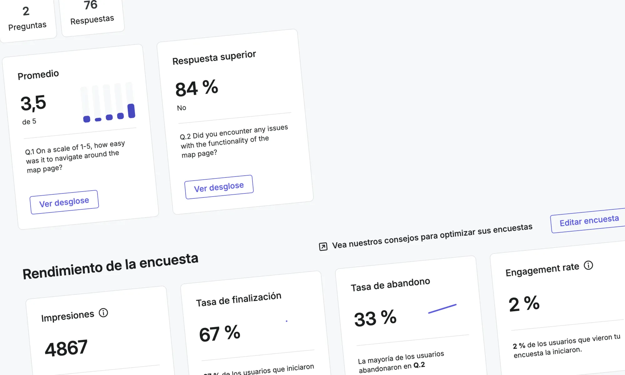
The survey primarily focused on users' perceptions of the map's ease of navigation, rated on a scale of 1 to 5. The general average rating was 3.79 out of 5, with a standard deviation of 1.41. The median was 4.0. This indicated that a majority of users (45.95%) found the map easy to use, giving it the maximum score of 5. However, the standard deviation of 1.41 highlighted significant variability in responses, suggesting that a considerable portion of users (12.84%) faced considerable difficulties, rating it at the minimum of 1.
Also, we were able to gather other critical issues directly from user feedback:
Performance issues
Users frequently reported "Mto lerdo" (Very slow) and "Too much waiting for loading", indicating that the map's loading speed and responsiveness were significant pain points. This problem was also noted as "El mapa es lento al cargar o al realizar acciones como el zoom o el scroll" (the map is slow when loading or in action such as zooming or scrolling) and "El mapa tarda mucho en hacer la carga inicial" (the map takes too long to make the initial load) .
Interactive behavior
Users reported zoom malfunctions, scroll issues and frictions finding specific locations For example "el zoom no funciona bien desapareciendo precios y hoteles" (zoom does not work well and hotels disappear).
Price visualization
Users found that "Todos los precios aparecen juntos y es difícil seleccionar un hotel", indicating overlapping prices that made difficult the selection of specific hotels. This was a key driver for the "results visual clutter" problem.
Lack of contextual information
A notable complaint was "Not showing public transport lines", emphasizing the need for integrating more vital contextual information directly into the map, a problem also heavily underscored by user interviews and competitor analysis.
Learnings and impact
The survey learnings were instrumental in shaping the overall understanding of the map's deficiencies and prioritizing solutions:
Validation of key pain points
The survey quantitatively confirmed issues that emerged qualitatively from user interviews and behavioral analytics, such as slow loading times and visual clutter from overlapping prices. This consensus across methodologies provided strong evidence for these problems.
Prioritization of improvements
The consistent feedback on "Molto lerdo" and "Too much waiting for loading" directly contributed to prioritizing the "non-blocking load interaction" as a "MUST HAVE" solution. The goal was to ensure the map remained fluid even during content loading.
Emphasis on visual clarity
The complaints about disappearing prices during zoom and the difficulty in selecting hotels due to overlapping prices reinforced the need for implementing clustering techniques and redesigning hotel markers. This addressed the "results visual clutter" problem, which was a "MUST HAVE". Also, thank to this feedback, we perfected the new search interactions.
Addressing contextual information gaps
The explicit request for "Not showing public transport lines" directly influenced the decision to include public transport stations, airport locations, and parking information as "MUST HAVE" contextual data on the map. This aimed to reduce user reliance on external tools like Google Maps.
Refining filter requirements
While not a primary focus of the survey questions provided, the general feedback on functionality and ease of use, combined with specific feature expectations gathered, contributed to the "SHOULD HAVE" recommendations for adding important missing filters (meal plans, pets allowed) and improving filter visibility and recall for users. As this features appear globally on the Stayforlong website, we considered with the team that this improvements were out of scope on this project and would be addressed later in a different project.
Highlighting mobile vs. desktop UX
The difference in perceived ease of navigation between phone and desktop users, with phones scoring higher, highlighted the need for specific optimizations for each device. While mobile navigation was rated better, the overall project acknowledged the shorter mobile session duration from behavioral analytics, pushing for mobile-specific enhancements like a search bar.
Strategic decisions for AB testing
The survey's role in gauging feature expectations, such as for public transport options, informed the design of A/B tests. For instance, testing the impact of different contextual information layers (like AVUXI vs. Google Maps POIs) was crucial to validate design choices that address user needs without negatively impacting performance.
Unmet user needs
The survey open-ended feedback questions also proved as a great tool to gather new feature and optimization ideas that our user experience was still not covering.
In conclusion, the user surveys provided critical quantitative data and direct user verbatim that clarified the problem definition, validated hypotheses, and guided the strategic design and prioritization of solutions for the Stayforlong map optimization project. They ensured that the implemented changes directly addressed user frustrations and unmet needs, laying the baseline for an improved user experience, engagement and conversion rates.
VALIDATION
A/B Testing
A/B testing served as a critical methodology to validate design variations and measure their impact on user behavior and business key performance indicators (KPIs). This approach aimed to ensure that proposed changes genuinely improved the user experience and contributed positively to Stayforlong's strategic goals, as well as proving confidence on the usage of specific funcionalities.
The two design versions we measured in the A/B Test.
Objective of the A/B Test:
-
Reduce friction and confusion: of the actual AVUXI heatmaps on the map, that we detected on user interviews that are actually causing some friction.
-
Evaluate alternatives: to compare the existing AVUXI heatmaps with personalized points of interest (POIs) from Google Maps.
-
Improve design integration: evaluate how a new style on the map could integrate better and impact performance into Stayforlong’s UI.
-
Cost savings: the AVUXI location heatmap feature had a daily cost that we could save by implementing Google Map POIs.
-
Enhance usability: the new version also included a visible zoom control on desktop, reducing frictions we saw during the behavior analysis.
Methodology and reach:
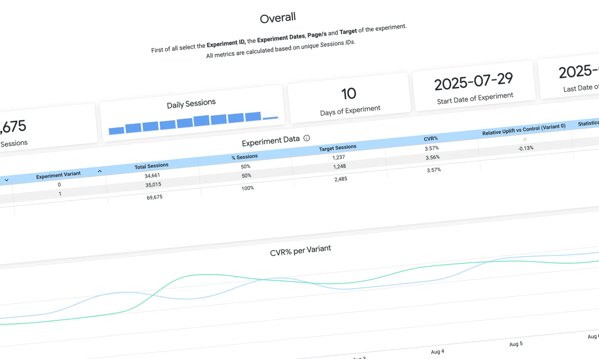
The A/B test was active from July 29, 2025, to August 7, 2025. It was paused after reaching +100,000 sessions per variant and statistical significance on the results. We developed all the A/B Tests internally at Stayforlong, and monitored the performance on a specific dashboard built by the Data team on Looker Studio.
Key learnings:
-
Inconclusive results: the A/B test concluded with an INCONCLUSIVE outcome, meaning there was no statistically significant difference in performance between the AVUXI heatmaps and the Google Maps POIs after 100,000 sessions per variant. This indicated that neither variant clearly outperformed the other in terms of conversion rate.
-
Balancing qualitative and quantitative feedback: despite qualitative user feedback indicating confusion with AVUXI's color overlays ("I don't understand these colors," "I thought it was a temperature but it's not. It's not clear"), prior A/B tests had validated that the AVUXI block provided some value. This created an "insecurity about eliminating this feature" without clear quantitative proof that the alternative was superior. This situation highlighted the challenge of reconciling strong qualitative user sentiment with inconclusive quantitative data.
-
Value of iteration in uncertainty: the inconclusive result did not mean the problem was ignored. Instead, it prompted an iterative solution, demonstrating a flexible approach to product development when clear winners aren't immediately identified.
The resulting design iteration after the inconclusive A/B Test including: new map background styles integrated with our UI, the optimized AVUXI button group with the heatmap layer not visible by default and the zoom control.
Despite the inconclusive result of the AB Test, it helped with the implementation of new design iterations. Given the inconclusive results, a "mixed result" or "intermediate solution" was implemented. This involved launching the map with the new UI (new map styles with optimized POIs, removing AVUXI as the default layer). However, the AVUXI layer was not removed entirely but made non-visible by default, only appearing when the user specifically clicked on it. This solution ensured that a potentially useful feature was still accessible for userds who understand it and want to use it, while reducing visual clutter and confusion for others.
Although initially the balance of the team towards only relying on quantitative data was a little bit frustrating to me and I was defending the strong qualitative evidence of the UX frictions with the AVUXI layer, I think that the final solution found the sweet spot for all our users, reducing frictions and still providing value. It was interesting how even without a clear outcome from the AB Test we were able to extract strong knowledge from the validation that helped inform the future design decisions.
DELIVERY
Research Conclusions
The research phase was essential for accurately identifying the map's problems, understanding user needs, and establishing a solid foundation for designing high-impact solutions. The conclusions were developed from a rigorous process that combined in-depth qualitative insights with measurable quantitative data, reflecting a conscious effort to design in a data-driven way. I believe it was a great success for the project to be able to work initially on the research without the “pressure” of meeting deadlines, and it was not until the research phase was completed that the goal of redesigning the map was set as a UX objective for Q3 2025, bringing the developers into play.
“We planned and prioritized solutions iteratively using the “release notes” system, delivering value incrementally.”
This facilitated, on the one hand, the measurement of the project's success and, on the other, the focused work of the back-end and front-end teams on smaller, easy-to-address functionalities. From the point of view of my scope, it meant more work, but I believe that working this way to ensure the success of the project was a success. Read below the key design decisions.
DELIVERY
Key Design Decisions
The Stayforlong map was loaded with features and interactive elements that were reviewed. Here is the complete list of decisions made for the new design based on the findings made during the discovery phase of this project:
-
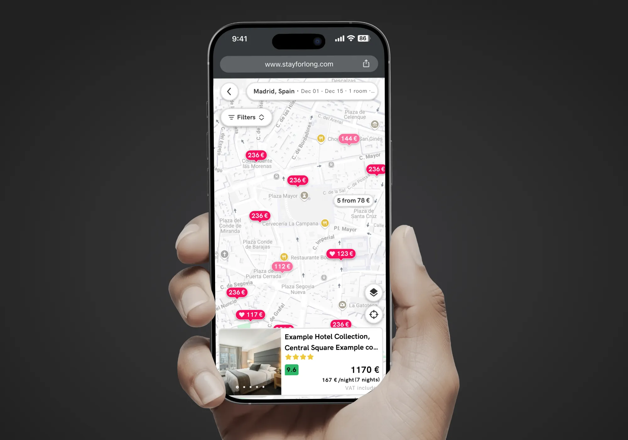
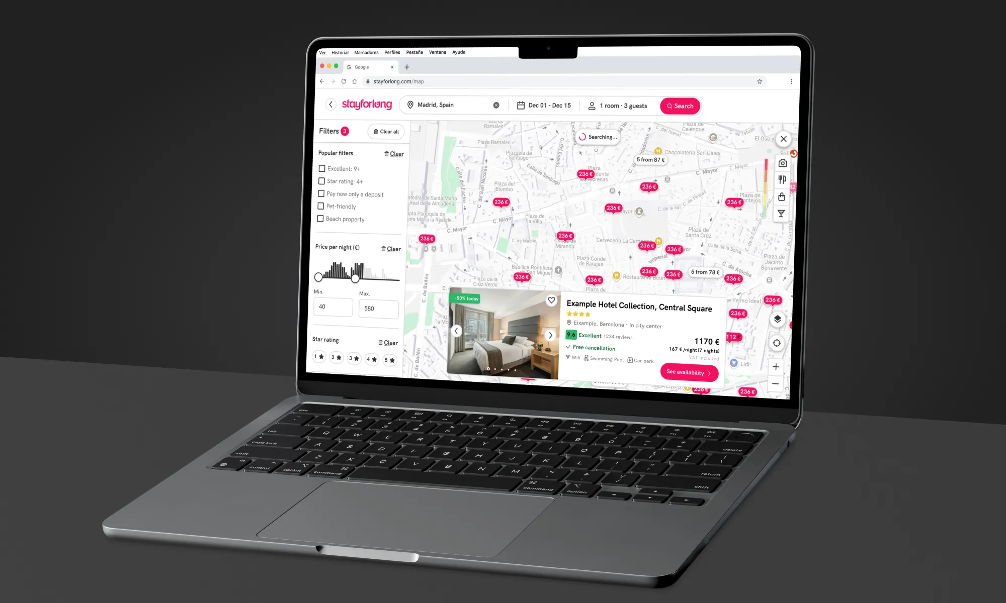
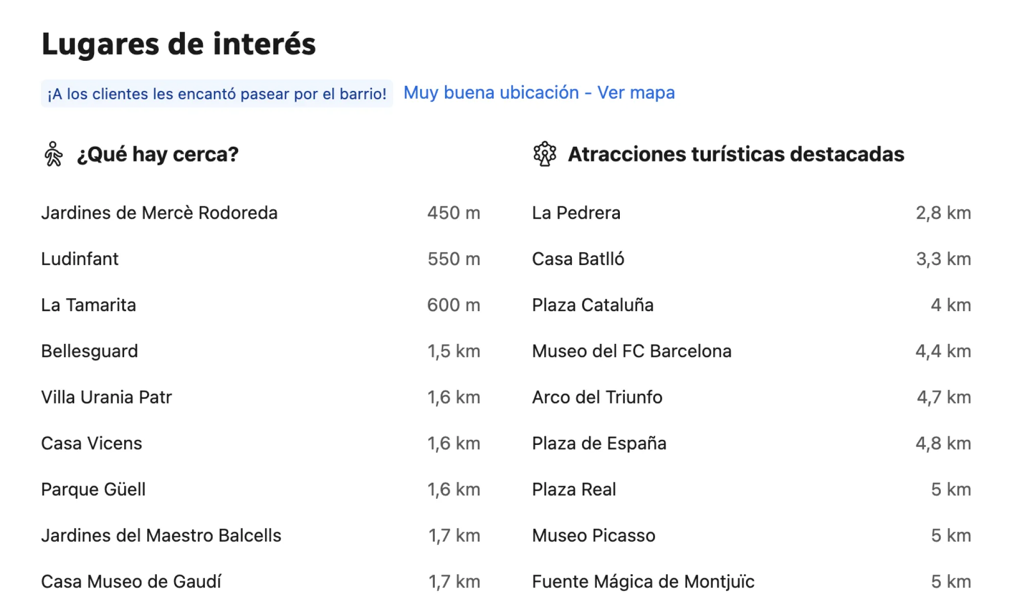
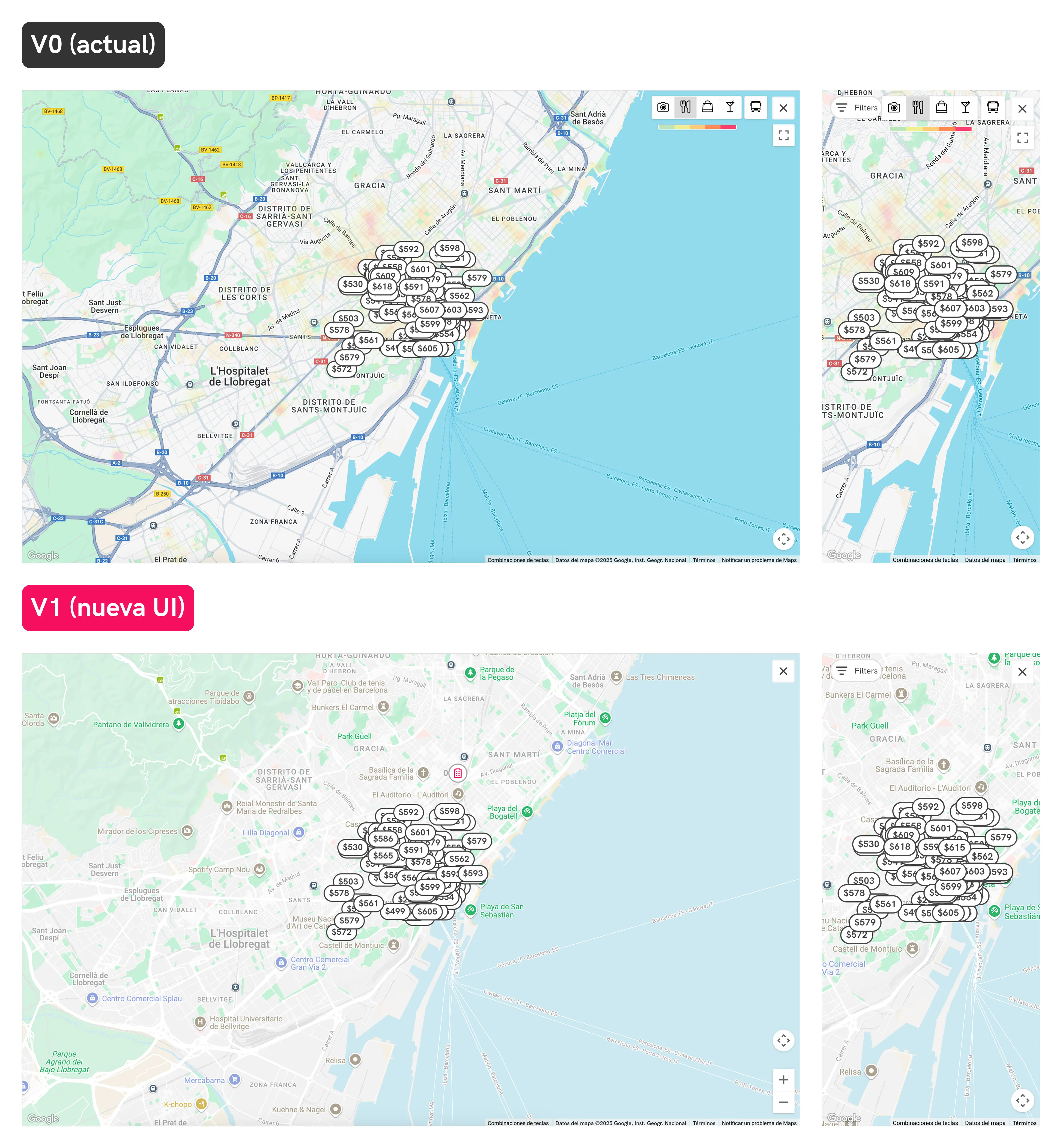
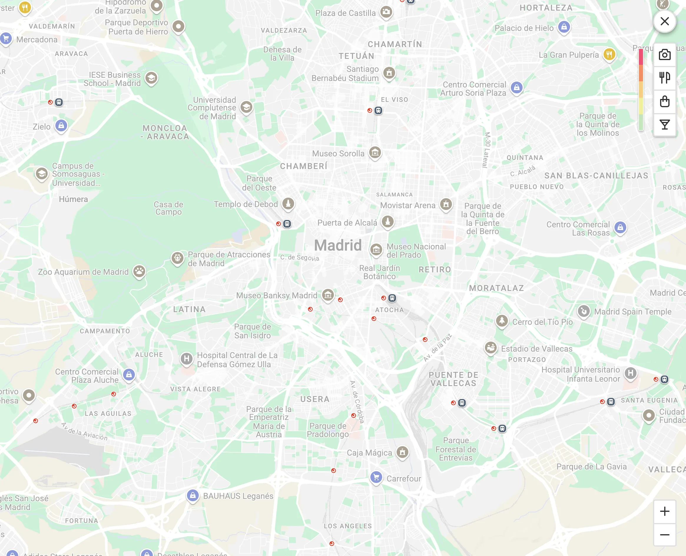
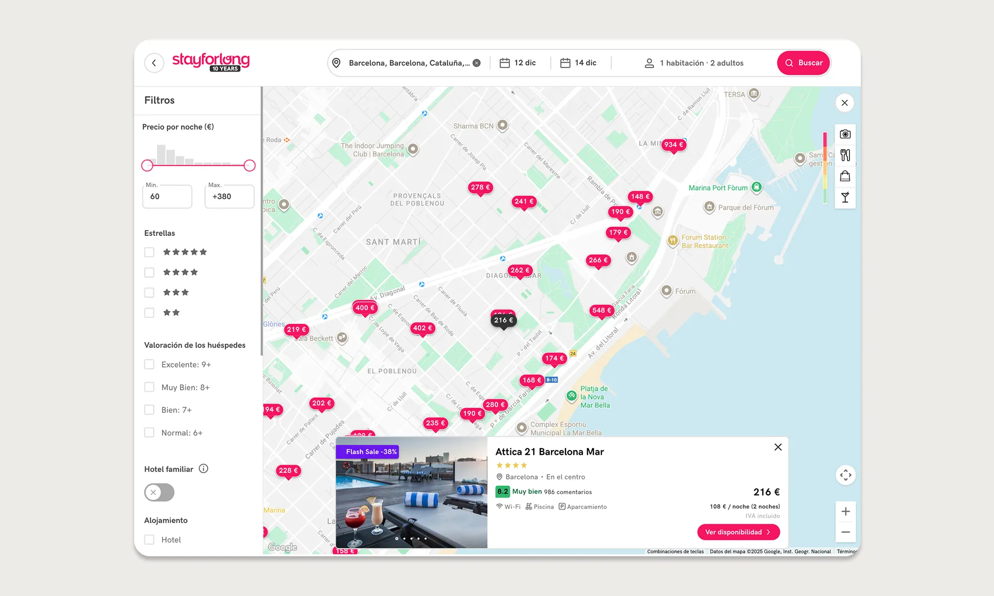
New map background styles with optimized POIs: We add points of interest and provide information to the map to help users explore locations and turn the map into a central & unified decision-making tool for their accommodation. We also took the opportunity to review the map styles, improve contrasts of texts and hotel markers that will appear over it, and better integrate the map into the Stayforlong brand book.
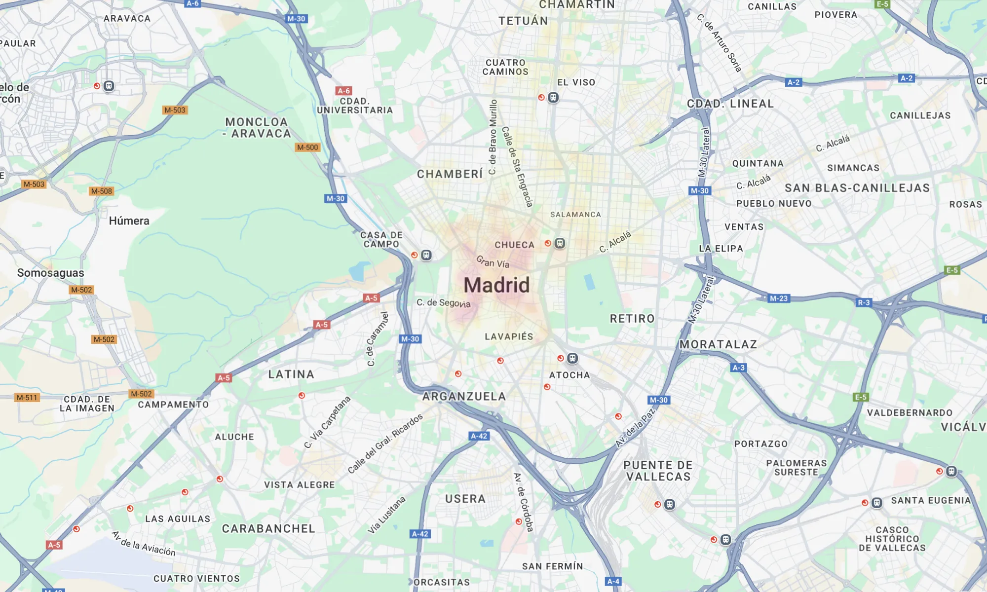
Old UI (desktop)
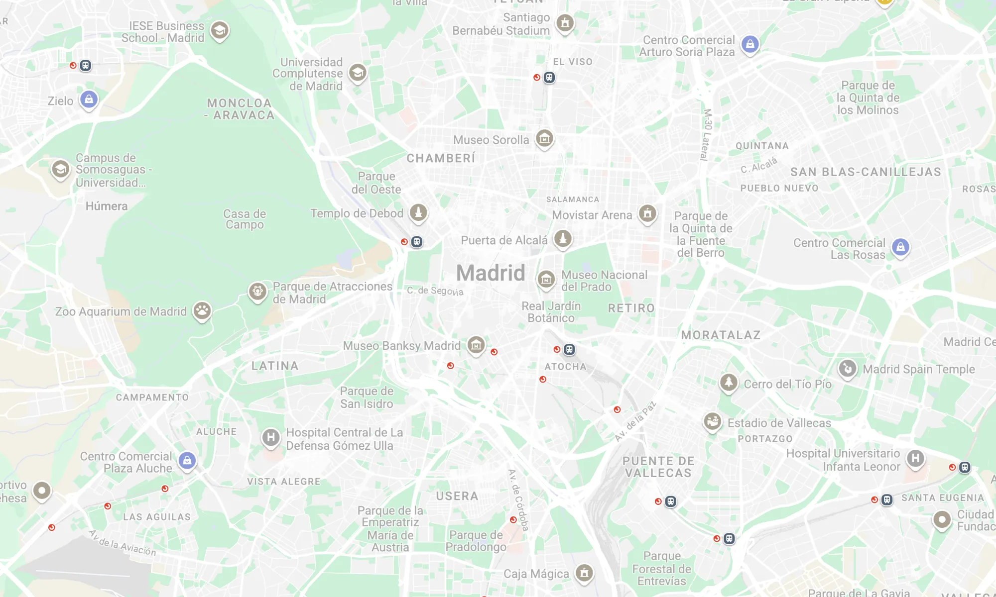
New UI (desktop). The new map provides rich contextual information and it is more integrated with our UI.
-
New non-blocker loading interaction: We have eliminated friction with the new loading interaction, which now does not hide previous results or block map movement or UI while loading new results, resulting in smoother experience.
Old map load interaction
The new loading interaction enhances a non-blocking experience.
-
Add zoom control for map in desktop: To eliminate rage clicks from users who double-click on the background of the map to zoom in and provide a better experience offering more control to users.
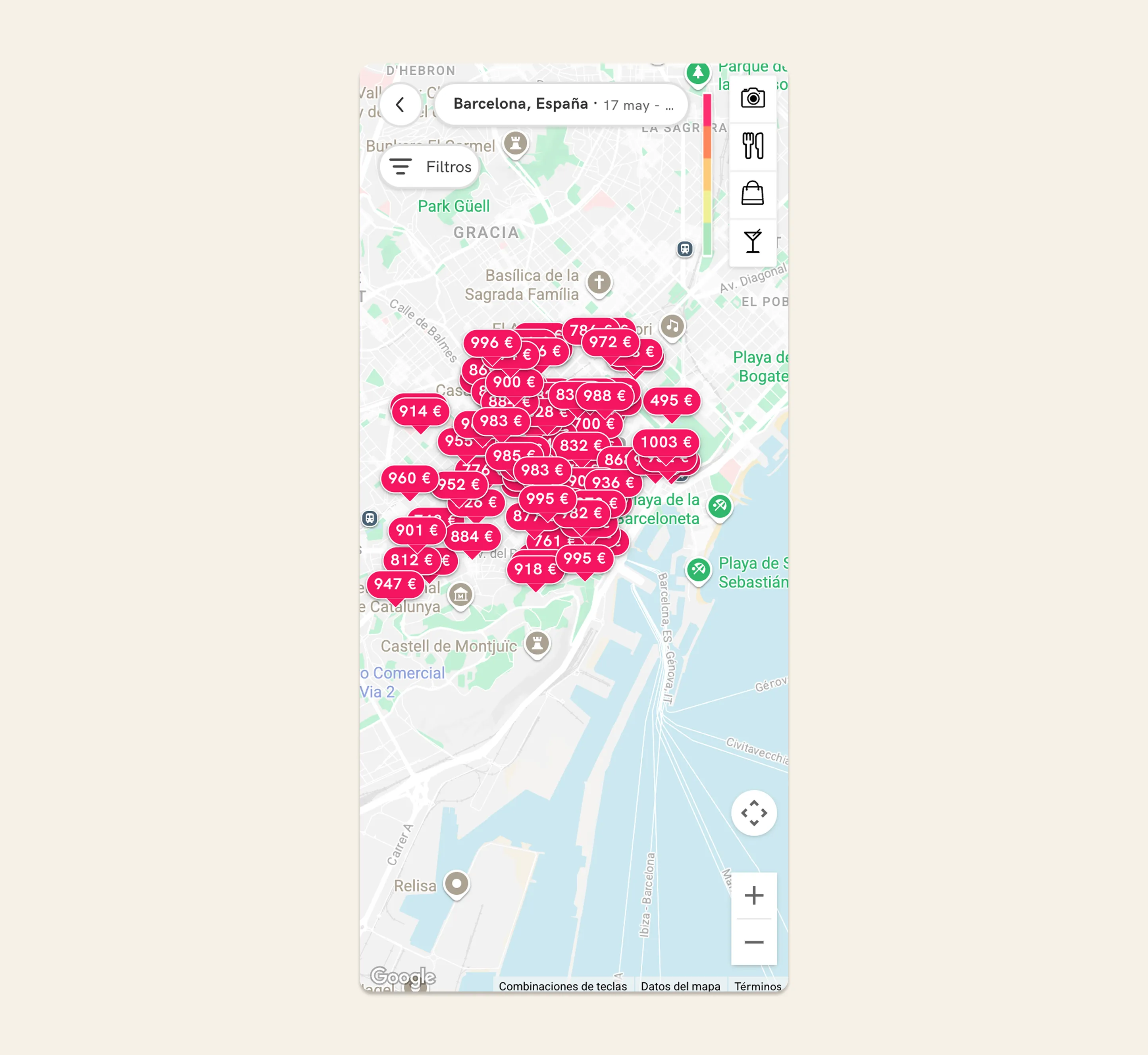
Old UI without zoom control generated rage clicks
New zoom control added.
-
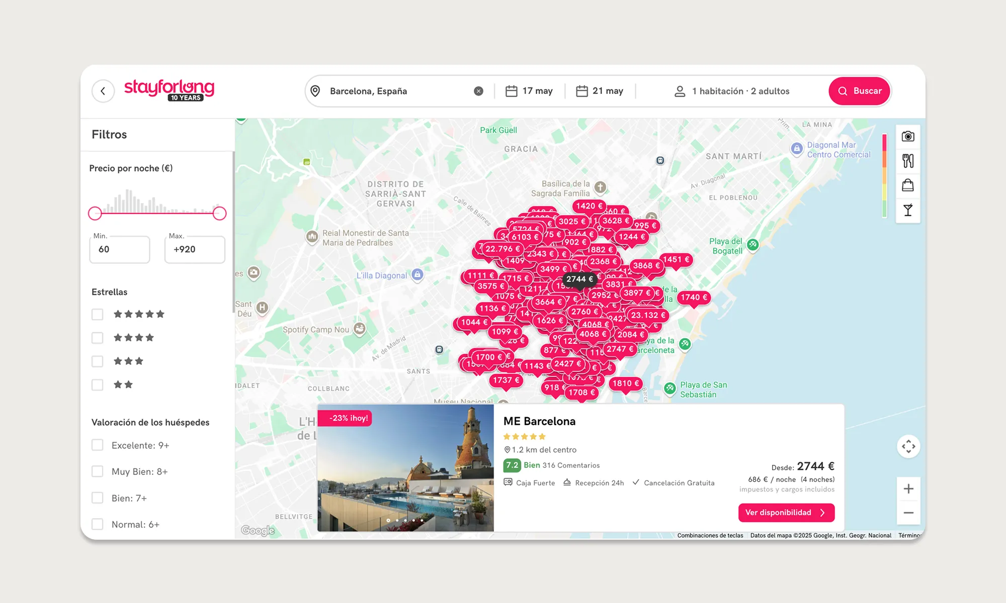
New map marker UI: We give hotel markers the appearance of a main CTA to increase user recognition and make the experience more consistent with the entire flow. It will also generate greater contrast with the new cluster markers we will add to the map and respect the hierarchy (read next).
Old UI problems
New UI: the new hotel marker is much more visible, generating more contrast with the background and with CTA aspect.
-
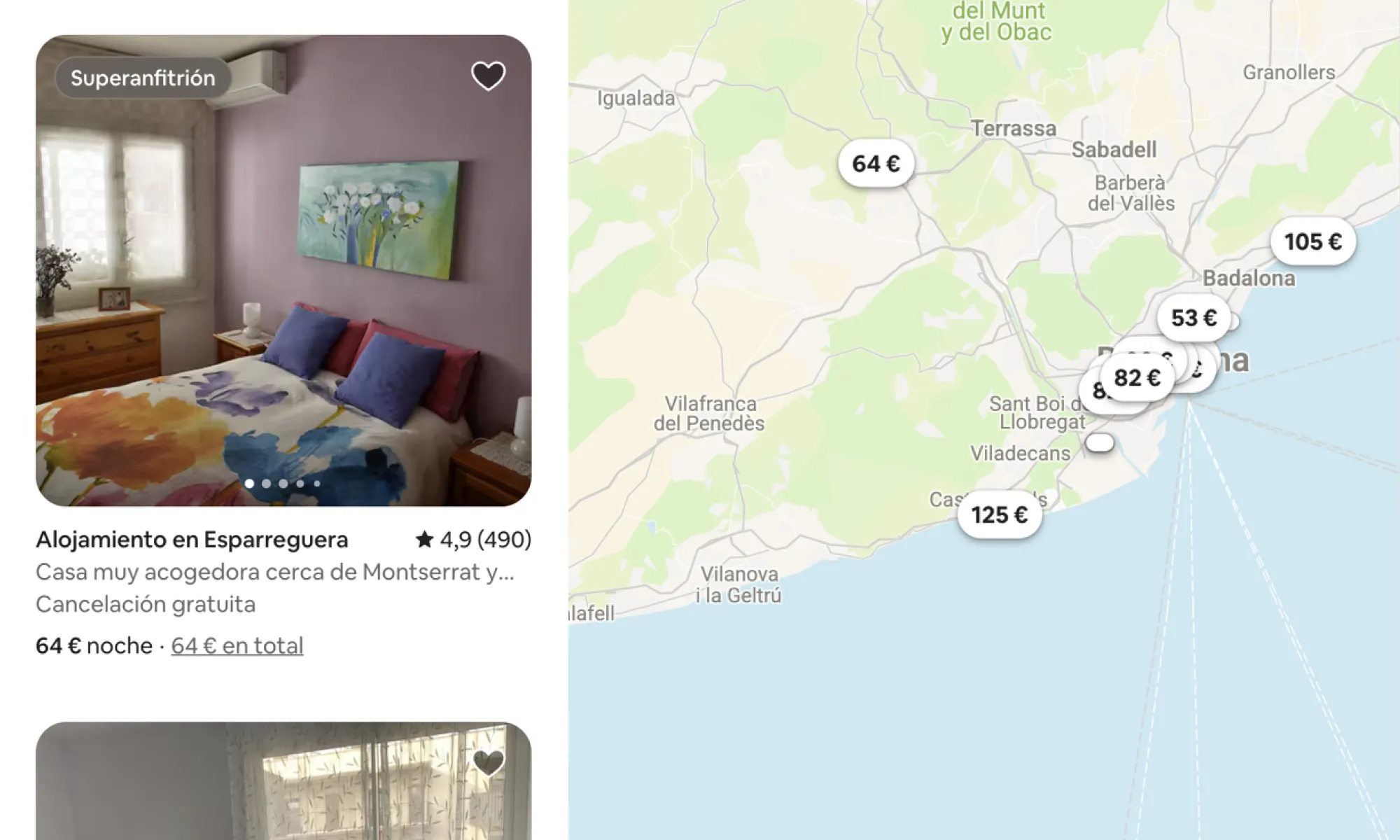
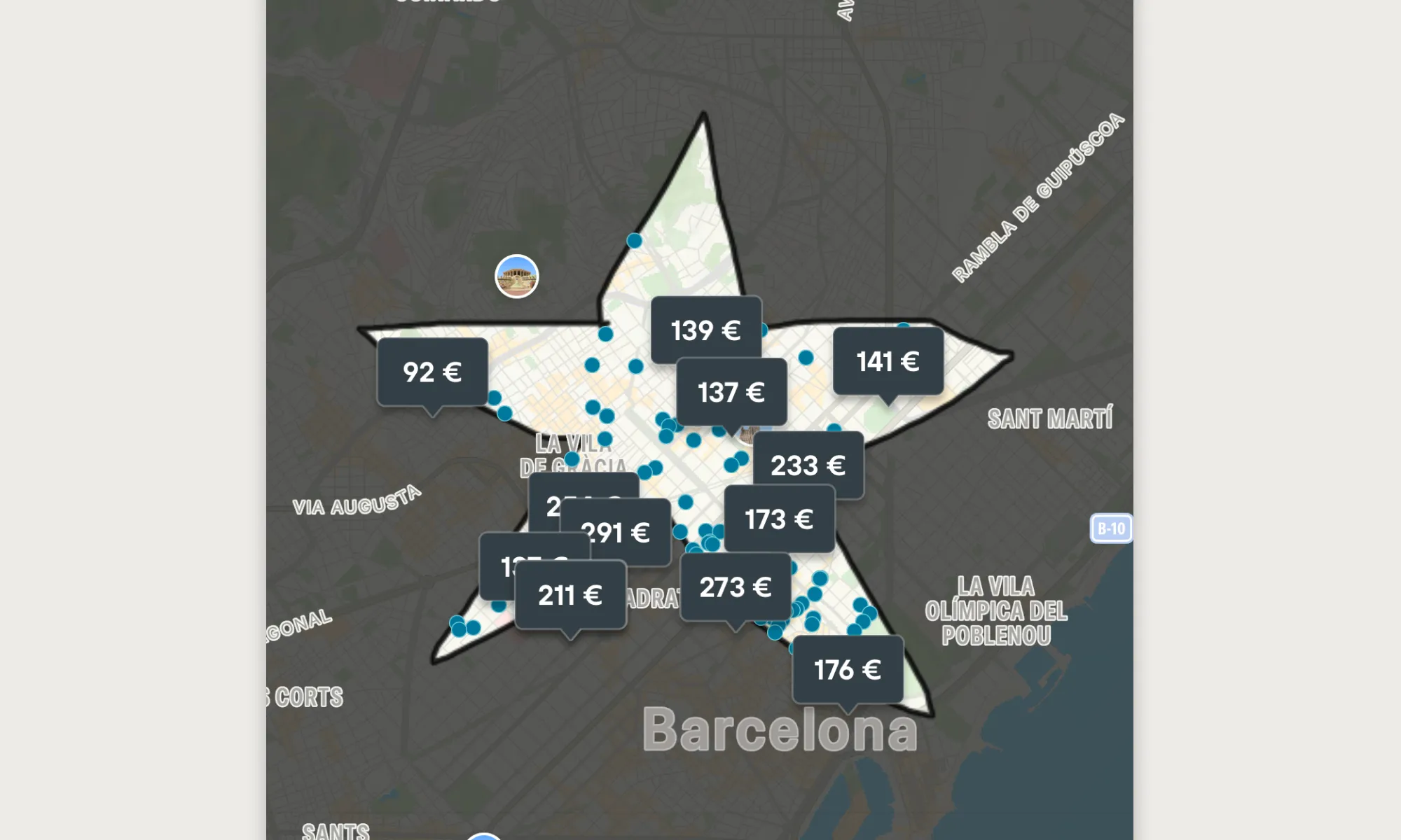
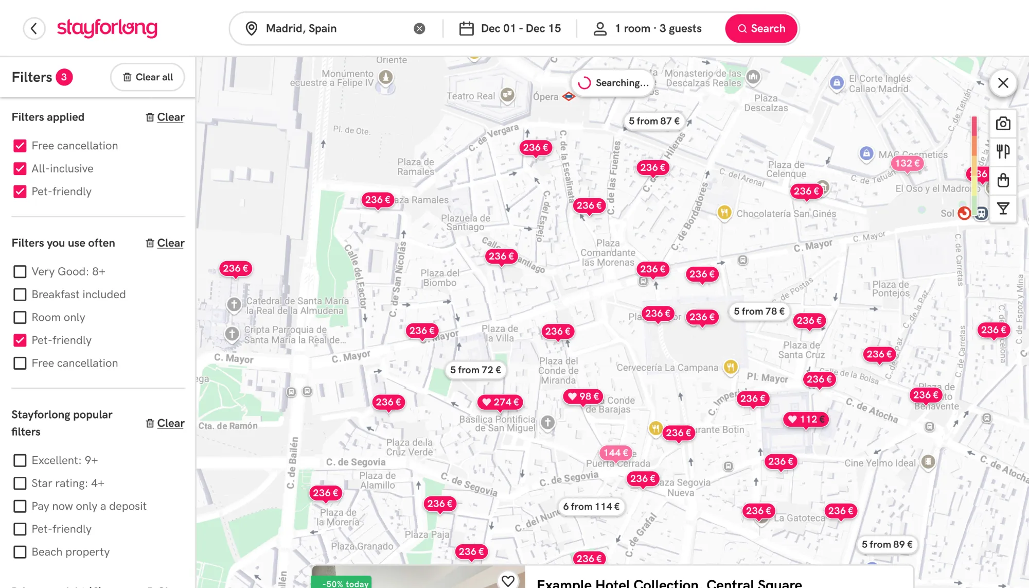
Add clusters grouping hotels in map: As a measure to reduce the visual clutter of the map, we came across with the solution of grouping nearby hotels in a cluster or group of hotels. We have used a variable algorithm that groups a minimum of five nearby hotels by proximity radius. At lower zoom levels, the grouping radius is larger, and as the zoom level increases, the grouping radius decreases. This way, we have managed to create a consistent experience that is always free of results density regardless of the zoom level. By using a minimum value of 5 hotels to create a cluster, we ensure a balance between displaying hotel pins and cluster pins, thus avoiding confusion for the user as individual results are always visible (not only clusters). This process has been carried out through various rounds of adjustments, as we could not see the real impact of the changes until we saw them in production (since the results database in the test environments is much smaller).
Old UI
New UI: With the clustering system, we ensure an experience without density of results at all zoom levels.
-
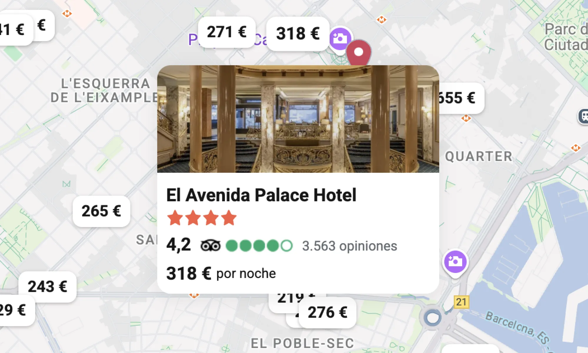
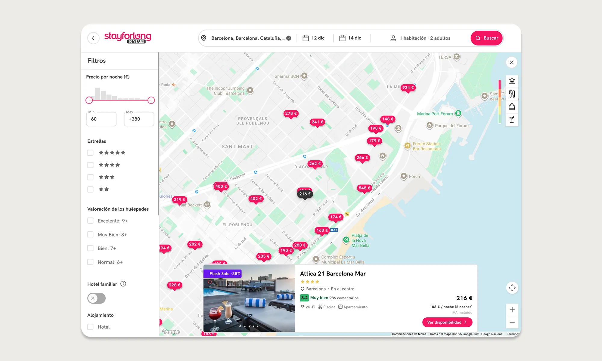
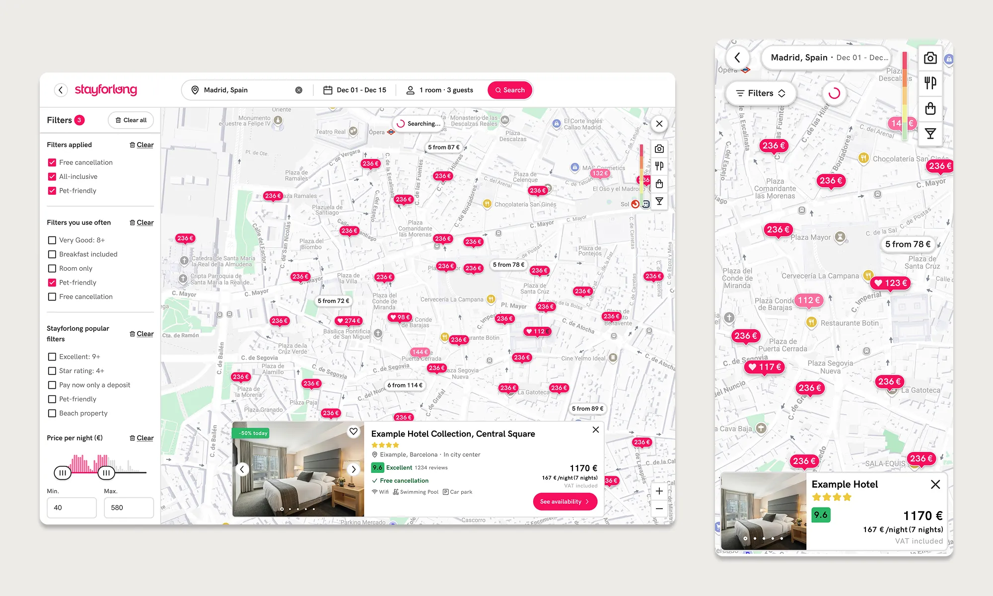
Display fixed hotel cards: To avoid problems with clipped content, we place hotel cards in a secure and highly visible location, so it is more comfortable for users to read its content regardless of the device. We also added a close action button, so that users can hide the card visualization if they want to continue browsing the map.
Old UI
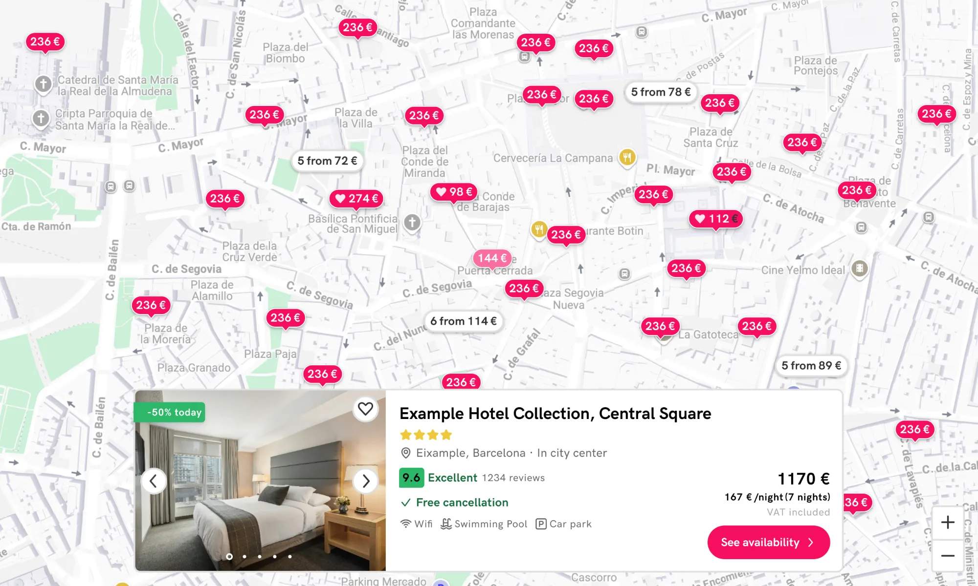
New UI: Hotel information is now easier to review on all devices, reducing frictions.
-
Add search bar in mobile and tablet: As we discovered it was one of the most interacted elements on desktop, we also added this functionality to mobile and tablet devices to encourage exploration of new locations and avoid a more fragmented experience, looking for an increase in average sesion duration in the map on those devices.
Old UI
New UI: Users can now perform new searches without having to leave the map in tablet and mobile.
-
Refine search interaction: We have paid close attention to detail to ensure a consistent and intuitive automatic search experience when users navigate the map. We have manually configured the amount of variation in latitude and longitude (movement) on the map that triggers a new search, and the value changes at each of the 21 zoom levels we offer on the map.
const ZOOM_DELTAS = {0: 4.0, // World view 1: 2.0, // Continental 2: 1.0, // Continental 3: 0.5, // Country 4: 0.25, // Country 5: 0.125, // Large region 6: 0.0625, // Region 7: 0.05, // Metro area 8: 0.025, // City 9: 0.015, // City districts 10: 0.01, // Neighborhoods 11: 0.008, // Large streets 12: 0.005, // Streets 13: 0.003, // Street blocks 14: 0.002, // Small streets 15: 0.001, // Buildings 16: 0.0008, // Building details 17: 0.0005, // Very detailed 18: 0.0003, // Maximum detail 19: 0.0002, 20: 0.0001};
In this way, we have managed to provide a consistent experience for new searches. In addition, we have applied an exception for when there are accumulations of movements, so that if you make many short movements, it ends up performing a new search as well.
We have also decided to restrict searches when clicking on the zoom in control on desktop or when clicking on a cluster of hotels, to ensure that the experience is smooth and the results remain consistent (if the cluster indicates 10 hotels, when accessing the cluster there should be 10 hotels; if we perform a new search, the number may not match, causing friction).
With this decision, we discarded an approach that we detected in some competitors during the benchmark. What they did was to eliminate automatic search when moving around the map and include a “Search in this area” button. As we want to promote the least blocking solution, we have not opted for this approach.
-
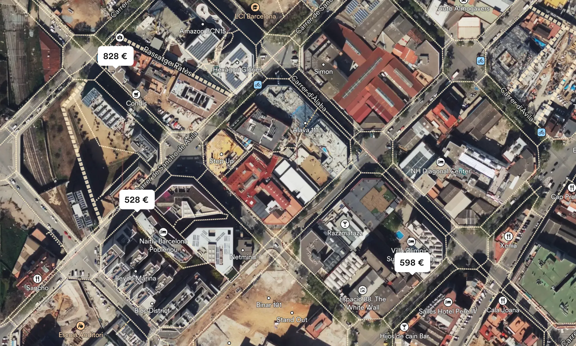
Fix overlapping elements: We have taken many measures to prevent overlapping results on the map, which was one of the main UX frictions, but we cannot assume that we have eliminated them 100% for all locations, viewports, etc. That’s why we have implemented logic on the map so that, in the event of overlap, the cluster containing the most hotels is always displayed on top, and also the cheapest hotel if the overlapping elements are hotel pins. In addition, the element hovered over on the map will always be positioned above the others.
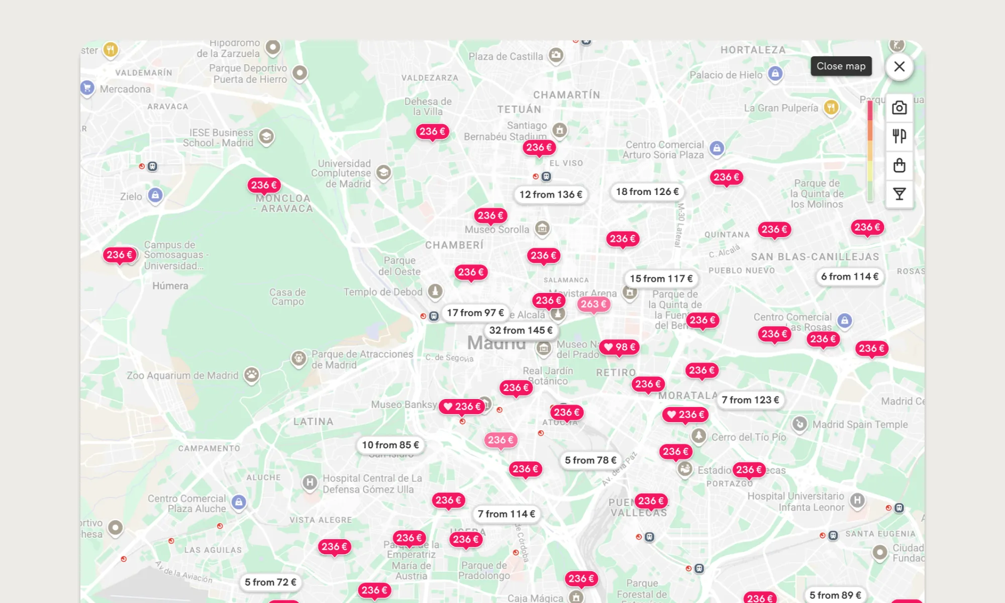
-
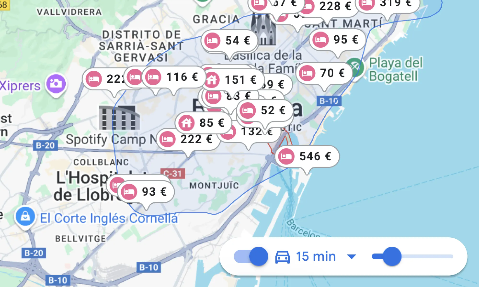
Implement geoshape for map results: The search results system on the old map was based on displaying up to 300 accommodations based on a central point of the specific location. For example, if the location the user searched for was “Barcelona”, a specific point of latitude and longitude located in the center of Barcelona was taken as a reference and up to a maximum of 300 accommodations were displayed (no more due to back-end hard-limit). My recommendation from UX perspective was to modify this search system, as it contributed to greater result density on the center of the map impacting negatively in user experience. To achieve this, we worked together with Back-end to develop a new search system capable of distributing results evenly across the search area (as we named it in the project: the geoshape). This way, there are no results concentrated in the middle of the map. At the same time, we were also able to increase the maximum number of results to 1,000 without affecting performance.
Old UI
New UI: Now the map offers more results that are more evenly distributed, decluttering the map from the initial load.
-
Optimized navigation buttons in map: We optimized the navigation element buttons for each device, to keep the design minimal while offering clear navigation indicators.
Old UI
New UI: we show a close map/back button depending on the device. We use tooltips in the desktop version to add context to action buttons while keeping the UI minimalist.
-
Optimized AVUXI layer visualization: As we detected friction during user interviews to understand the feature, and during A/B testing we did not see a direct impact on whether or not to have the feature, we decided to optimize its display.
Old UI
New UI: now the feature is not displayed by default, and we show help texts to make the UI self-explanatory. By measuring the CTR, we will decide whether to remove the feature or not based on its usage.
-
Add close button in hotel cards and refined interaction: We added a visible control to hide the hotel card that appears when clicking on a marker on the map. We also configured the logic so that the information card is automatically hidden when the hotel pin is no longer visible on the map (we assume that the user has lost interest in that hotel).
Old UI
New UI: we ensure that there is no friction with the hotel information that is provided when clicking on a pin adding an option for the user to hide it.
DELIVERY
Solution Design
This is the final result after all the optimizations made to the map, compared to the initial state in which we started the optimization project.
Old UI
New UI
“This design is result from the combination of customer feedback from user interviews and surveys, analizing recordings and heatmaps, competitor analysis and all the different validation stages”
VALIDATION
Testing the new design
The validation format proposed for this project has been a great success in ensuring that each iteration was measured in detail in order to gauge the project's success, while also allowing us to be agile in each new implementation. The release-notes iterative system has proven its success because it allowed us to separate the final UI in small achievable steps for the dev team, that could be uploaded separately in prod and be measured independently. When I worked on the delivery of this project, I collaborated with the Engineering Manager to break down the development into individual parts.
In this way, we have focused development on tasks that are much easier and simpler to tackle (both for Devs, QA and me as Designer), and we have been able to solve problems that occurred in the past at the company when attempts were made to completely redesign the map without measuring the separate impact of each improvement. If the impact of any of the uploads was not as expected or an event was not configured correctly, we could know immediately, as we had 100% control over the KPI.
The data speaks for itself, but what do our users think? I also wanted to be able to obtain qualitative feedback and validation on users' impressions with the new map experience, verify that the Success Rate with the new design offered sufficient guarantees of success and that the System Usability Scale of the new design improved on that obtained during the initial surveys with the old system. Also, identify potential friction points or opportunities with the new design. I performed an async UX Test with 25 power users. Overall, results showed that 95% of users preferred the new UI vs the old one and a +80% success rate with the new system. The Sistem Usability Scale increased by 28% (from 64 to 82).
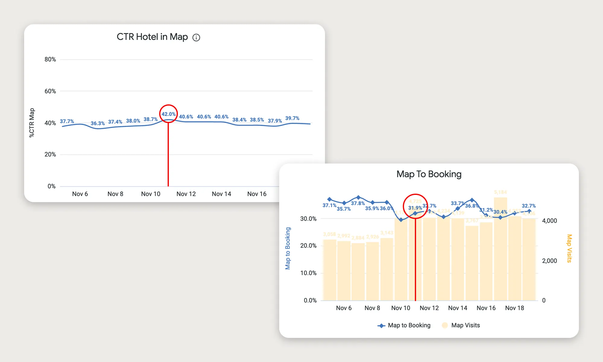
IMPACT
Launching the new design
To calculate the success of the map redesign project, the previous values from the last 12 months were used as a reference to ensure statistical significance and avoid comparing metrics altered by seasonality (a very common phenomenon in the travel sector). The outcomes were measured one month after the upload of the last development to ensure stable values in the metrics.
As I mentioned earlier in this case study, we worked with the Data team to exclude traffic altered by bots from the measurements, which could invalidate the measurements.
+17%
Map click-through rate
+25%
Map to Booking (CVR)
+43%
User session duration
+28%
Sistem Usability Scale (64 to 82)
95%
of users prefer new UI
80%
Success rate with new UI
“With the combination of qualitative and quantitative metrics to measure impact, we ensure the success of the project and a positive impact on UX.”
LEARNINGS
Personal thoughts
The Stayforlong map optimization project was a turning point in how I solve complex design problems with a strategic, data-driven approach, generating a measurable impact on user interaction.
Strengthening the central pillar of the long-stays OTA
There is now greater confidence within the company that the map is a key factor in users' booking decisions.

Cross-team alignment and tech challenges
Attention to detail and close collaboration with the front-end and back-end team led by the Engineering Manager have been key differentiators in this project.

Iterating beyond launch
Although we saw immediate results, this project has also enabled us to explore other approaches to further enhance the visibility of the map, such as exploring 50-50 layouts (map - list of results) as we mentioned at the beginning of this project.

The importance of being agile
This project has proven the succes of project planning and measurement systems. It has facilitated the work of all project members and aligned us in achieving a common goal.
Also, involving our users in the first phases of the project was key to the success of the project, since we had very good control over the different problems that the old system presented and also a clear vision for the solutions and opportunities discovered during the competitor benchmark and validation phases.
Even so, it was a little frustrating not to be able to make decisions based solely on qualitative insights due to mistrust in the team with some of the changes (although qualitative feedback clearly indicated a robust pattern), especially because we could be losing some of the map features. That meant I had to adapt the design by rethinking the initial design that had been validated with users, because some of the AB Tests were inconclusive and did not give us enough confidence. This has been a reminder of the critical need to always have data to inform design decisions, and how sometimes qualitative data can contradict quantitative data and the value of each data type.